
Would you be interested in owning a copy of an attractive new font called Middle Earth? If so, read on and you’ll find a link to download this typeface created by Swedish designer Måns Grebäck.
When it comes to fonts, there are basically two types of people – those who pay no attention to them as they read, and others who notice the nuances between similar fonts and are fascinated by extraordinary examples.
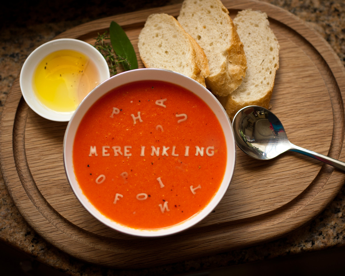
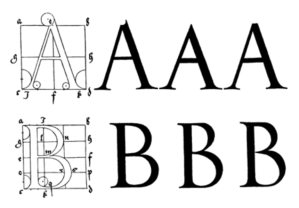
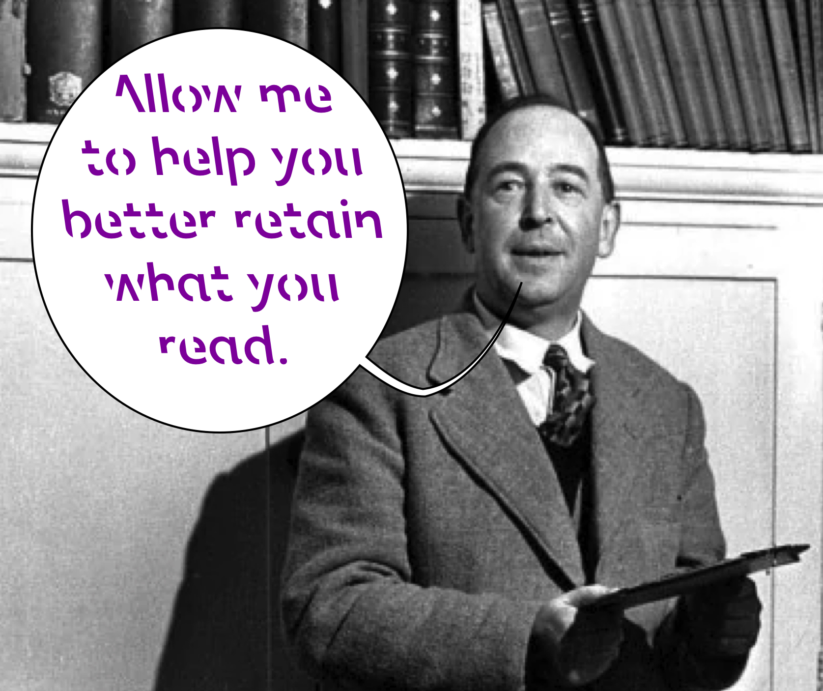
Longtime readers of Mere Inkling know I am in the latter category. Every year or two I actually write on the subject. I’ve discussed monastic fonts, legal fonts, trustworthy fonts, uninhibited fonts, a dyslexia font, a memory-enhancing font, fonts based on the handwriting of historical figures, and being a fontaholic.
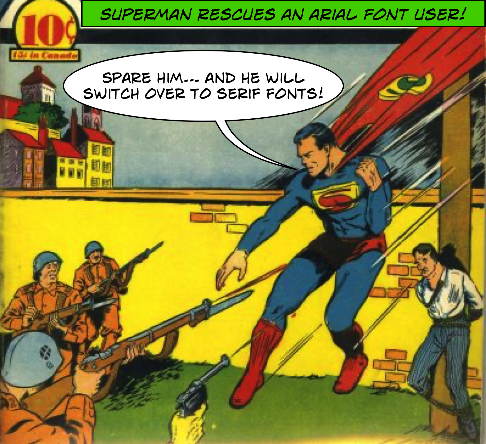
The reason for my current interest in fonts is due to Microsoft’s decision to jettison Calibri as their default font for Office products. They needed to make room for its replacement, Aptos. Seriously, when you view the two sans serif* fonts, side-by-side, you may be surprised at how little they differ.
To make matters even more confusing, CNBC describes a curious aspect of Aptos saga.
Aptos will remain available in the font list under the old Bierstadt name for people who are accustomed to it. Users can also choose to set any other font as the default.
Apple’s mac computers also allow users to choose their own defaults. One typography community discusses this selection opportunity, even as they bemoan the fact that in many programs, the standard installations include suboptimal fonts.
Unfortunately, many of us work on computers where we have no control over what fonts are loaded onto the machine, so we have created a list of the top 10 most common system fonts everyone should know and how to handle them.
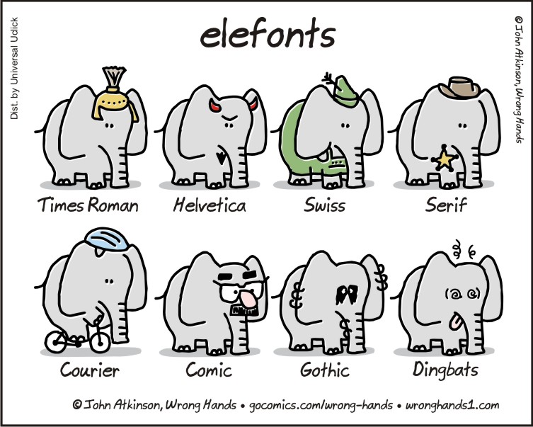
This website offers a brief description and history of ten of the most common fonts we typically encounter. For example:
Times New Roman is a serif typeface designed by Stanley Morison and Victor Lardent in 1931. It was commissioned by the British newspaper The Times, which wanted a new typeface to replace its existing font, Times Old Roman.
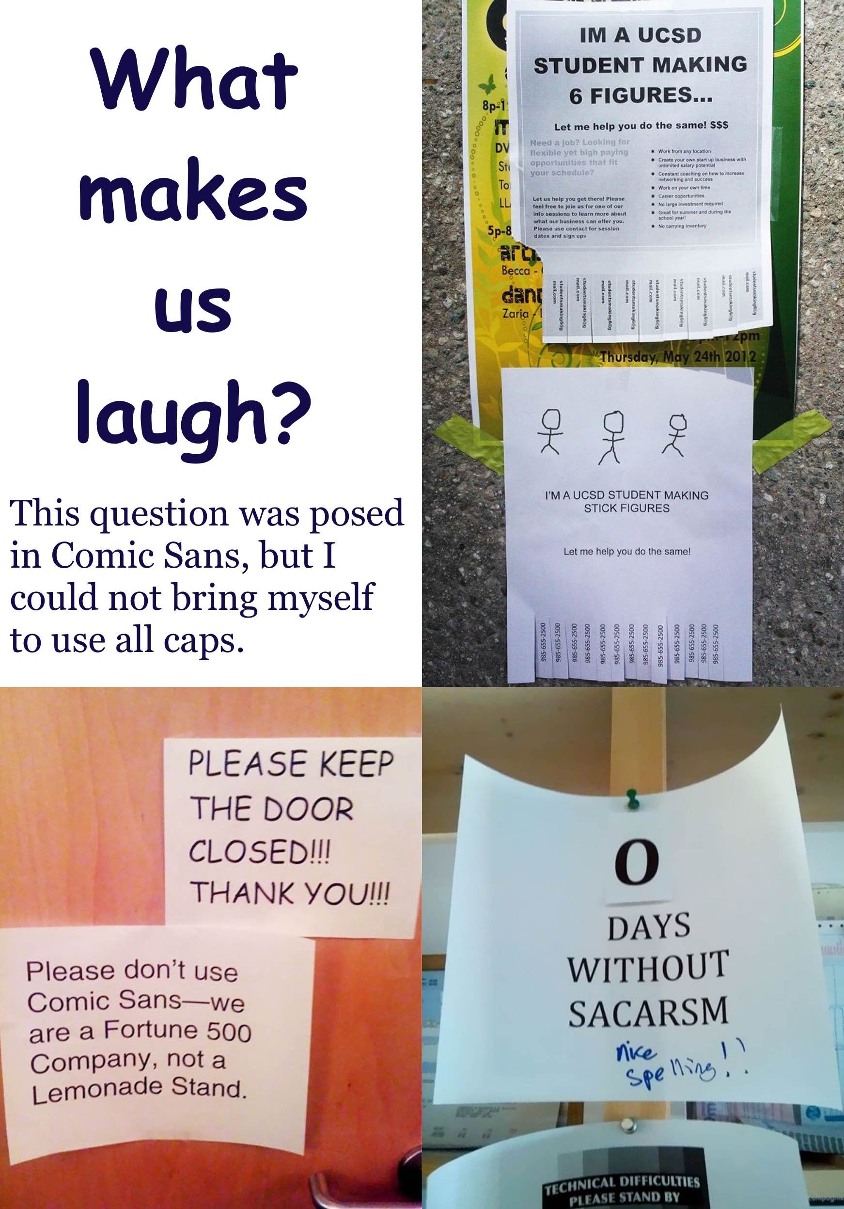
And I love their estimation of Comic Sans, one of my wife’s favorite fonts, which I avoid like the proverbial plague. (Delores is a young at heart special education teacher, and I’m more of a Lewisian dinosaur.)
Do use: if you are designing a comic for 6-year-olds.
Don’t use: if you want to be taken seriously by work colleagues.
Another pastor, who learned this lesson the hard way, shared his advice with the warning: “pastors don’t let your bulletins print out in Comic Sans!”
Apparently, his astute wife preserved his professional reputation by telling him to (1) avoid using a “smorgasbord of fonts” in a single document, and (2) “resist the temptation to print serious things in less than serious fonts.”
Advice for Writers
While authors have little control over the fonts in which their work is published by commercial publishers, they do have freedom to choose the typeface they use for the actual composition. “How To Choose the Best Font for Your Writing” addresses that latitude in the following way.
Do you have a favorite font? Are you dedicated to Times New Roman, or are you more of an “anything-but-Wingdings” kind of writer? Maybe you haven’t given your choice of font much thought.
Quite simply, as research shows, texts that look good make you feel good while interacting with them. This is why it’s so important to choose a font that not only is easy to read, optimizes line length, and has the right mood, but also is one that you like!
MasterClass describes the various aspects of each font that will contribute to your overall impression of each font. In “Typography for Writers: How to Pick the Best Type for Writing,” they explain the significance of bowls, ascenders, spines, counters, and more.
Typographers and type designers have their own universe of special terms, each of which refers to a specific part of a given letter. Understanding these basic elements of typography can help you decide precisely what typographic style you want to employ to grab your reader’s attention.
InDesignSkills goes so far as to match a number of typefaces to specific genres, saying “we judged the legibility, beauty, simplicity and variety of weights available of a huge range of fonts, and whittled them down to these faithful five.” They even offer an ironclad promise, proclaiming their selection will “never let your typesetting down, guaranteed.”
Obviously, personal tastes play a large role in appreciating or disapproving of various fonts. One author describes how the quest for the perfect font is integral to writers’ creativity.
Let’s talk about one of our favourite writing avoidance devices: picking the right font for your manuscript.
“The Best and Worst Fonts (and why they’re good or bad),” describes the bond a writer can develop with their typographic fancies.
Fonts are one of the most important design choices to make when developing your brand identity. The best fonts leave you feeling like you’ve made an instant friend while the worst fonts are like a stranger who won’t leave you alone.
The writer offers her personal preferences (and prejudices). I don’t agree with all of her judgments, but I am forced to concur with her inclusion of Jokerman and Bleeding Cowboys on the list of “worst fonts.” And I am pretty sure that C.S. Lewis would agree.
Write in the Spirit of Middle Earth
If you have read this far, your reward is to receive the download link for Middle Earth.
As noted aboved, Måns Grebäck is a prolific Swedish typographer. He makes many of his creations freely available to individuals for non-commercial use. (Commercial licenses are available as well.) The independent FontSpace describes it thusly:
With the historic charm of ancient manuscripts and the ethereal beauty of elven realms, Middle Earth typeface weaves tales of valor and legends. Its calligraphic allure is accentuated by rounded contours, reminiscent of Tolkien’s enchanted worlds.
Middle Earth truly is ethereally elegant. Enjoy.
* Sans serif fonts are those without serifs, which are the tiny lines or marks that appear at the end of a character’s stroke. Arial would be a common sans serif font, while Times New Roman is a familiar serif font.