
Every reader knows “not all books are created equal.” This fact has two applications. Most importantly, since books are built from words, the comparison refers to comparing the content or message of different works. In a totally distinct sense, it may distinguish between the differing presentation or physical aspects of the book itself.
Fifty-four years after its discovery, the oldest surviving Mayan text has been officially authenticated. One of the reasons for the delay was that “for a long time, critics of the codex said the style wasn’t Mayan and that it was ‘the ugliest’ of them in terms of figures and color.”
What does that mean? It means that just because the tree bark pages were composed by a less skilled artist . . . in a more primitive age . . . living in a relatively impoverished region . . . with a smaller pallet of colors available . . . its authenticity was questioned.
Not quite what I would consider top flight analysis. Fortunately, Mexico’s National Institute of History and Anthropology has finally righted that wrong. They declared, “The Mayan Codex is authentic and the oldest, legible pre-Hispanic manuscript in the Americas,”
Seriously, the only flaw I can find in the facsimile of the pictograph portrayed above is the attachment of a right hand to a left arm. Then again, if Mark Twain could make the very same mistake roughly eight centuries later, I can forgive the ancient Mayan illustrator.
Illustrative Options
Frankly, the more one learns about the publishing industry, the less responsible we can hold authors for the final look of their works. Rarely do they even get to choose the cover art for their books, although sometimes particularly prominent authors such as J.R.R. Tolkien or C.S. Lewis are granted that privilege. That is how the artwork of Pauline Baynes became intimately associated with the two Oxbridge giants.
The lucky few may even be able to select their own fonts, with many wisely opting for the more trustworthy serif families.
For the common woman or man, we are lucky if our publishers even let us have a veto over the artwork that they commission. The exception to this comes with the nature of the self-publishing industry, where the author possesses sole authority in choosing their cover, illustrations, fonts and format.
Still, those hoping for “traditional” publication should recognize in advance how much control over their book they will forfeit to editors and publishers.
With Paper at a Premium
Even with influence in the selection of artwork, some aspects of publishing lie outside the control of writers. A perfect example of this is found in rationing of paper in Britain during the Second World War. The British War Economy Standard meant books visually declined in production quality.
Paper was rationed, beginning in March 1940, when publishers were allowed only 60 percent of what they had used in 1938-39. The proportion fell to 37.5 percent by January 1, 1942, when the Book Production War Economy Agreement took effect.
The scheme mandated smaller type, less white space, and inferior papers and bindings. It resulted in some remarkably ugly books, but it conserved raw materials. (“Modernity and Print I: Britain 1890-1970” by Jonathan Rose)
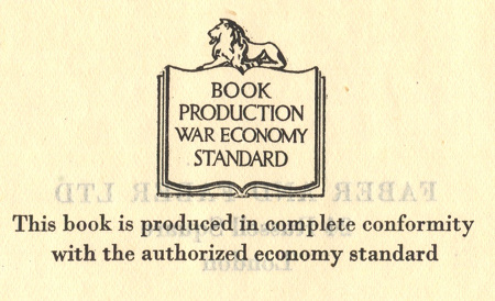
A number of Lewis’ books appeared in these wartime editions. They are quite collectible.
Scarce first impression of the true first edition, produced on wartime economy standard paper, and thin boards, published during the Second World War, especially hard to find in its complete original dustwrapper in collectable condition.
Let’s consider an unlikely scenario. In eight centuries, C.S. Lewis’ writings have been forgotten. Then, one archaeologist stumbles across a rare physical copy of a book, that survived the universal “grand purging” following the transfer of such items to some post-digital, post-electronic format.
What would historians assume about the value placed on Lewis’ work if it was a wartime edition compared to other “regular” books by other authors? They could not be faulted for assuming that the people of our day valued the inferior publication less than the “nicer” editions. (This is assuming that the acid-laden paper of the war years would not simply flake apart in their hands.)
The quality of the paper and print make a strong impression on readers. Just as we often judge books by their cover.
C.S. Lewis, a true bibliophile, illustrates how even a modest book (in terms of content) can be deemed “exquisite.” In a 1935 letter to his friend Arthur Greeves, he humorously describes the impending publication of The Allegory of Love.
I have finished my book which is called The Allegorical Love Poem, and is dedicated to Barfield. The Clarendon Press have accepted it and hope to have it out by May.
As I am to get 12 free copies (Dents only give one 6) you and Tchanie shall each have one and save your silver: and whatever you think of the matter, I hope, from experience of the Clarendon Press, that binding, paper etc will be—in our old formula—excellent, exquisite, and admirable.
In other words, if you can’t read it, you will enjoy looking at it, smelling it, and stroking it. If not a good book, it will be a good pet! It will be about 400 pp, they say. (It will be funny, after this, if they do it in double columns and a paper cover.)
Returning to the Mayan pages with which we began, we sadly are unable to judge them by their original codex in its pristine state. However, the extant pieces possess great historical value, even if scholars took a long time determining the fact . . . and whether or not they would ever consider it to be “a good pet.”
In case you are interested, Mere Inkling has explored Mayan books before, in “One Weakness of Modern Books.”

Which is why bibliophiles still love to read a print book over an electronic one, or at least prefer to own print copies.
Yes, indeed.
Hi Rob,
I know your message was the contents not the cover of a book, but something else popped out at me. When one does their own publication they hold so many rights then going to a traditional publisher. I am looking at that fork in the road and praying for a nudge.
Thank you,
Gary
That’s a complicated decision… Traditional publication is normally more “respected,” but you’re right about retaining all of your rights. That said, how much value do those rights (e.g. film or foreign language rights) have if we only reach a tiny audience?
I think the appropriate path is determined not only by the writer themself, but by each particular work. I, for example, have a couple projects which I’d love to get into the hands of a traditional press. Likewise, I’ve got some small projects in mind where self publishing would actually be the ideal course.
Praying you get clarity on that “nudge” soon.
Great insight. Different projects have different hands at work on it. Each one is treated as it should go.
Fascinating topic.
I’ve never really thought about the attractiveness of the insides of a book -experience in marketing tens to make you evaluate the cover and outer package, but didn’t notice what was obvious: the spacing, fonts, all sorts of things inside – which as you say, the author has so little control over…but it does make difference in readability with textbooks as well as reading comfort level for other books.
“Pet” – gotta love that
When it comes to the inside elements, I usually don’t take note of them unless they are odd. For example, extremely wide-spaced or condensed leadings bother me. They shout “lazy writer” (trying to make the book appear more substantial than it is) and “amateur” (ugly formatting), respectively.
As for treating a book like a pet… that’s certainly a novel insight. Caressing and cuddling favorite tomes may come naturally, however.
HA – have to agree with you on the wide margins and excessive white space!
Some of them average about 9 lines per page… at 11 words on average, I don’t think their readers are getting their money’s worth.
Pingback: Beware of Publishers « Mere Inkling Press
Pingback: Judging by Appearances – Mere Inkling Press