Consider yourself blessed if you’re not a fontaholic. The affliction leads to clogged font directories on your computer, and an unavoidable prejudice toward either serif or sans serif fonts.
People who are intrigued by typography know exactly what I’m talking about. At least two or three times a year they will inextricably find themselves on some font website (there are scores of them) without consciously knowing how they got there or there or there.*
I’ve written about fontaholicism in the past. Unfortunately, despite my advocacy, the Diagnostic and Statistical Manual of Mental Disorders has yet to classify the malady as a recognized illness. That said, the American Psychiatric Association does sound a bit obsessive compulsive in terms of their font guidance for annual meeting posters.
If any or all of the work in this poster was prepared with commercial support, a statement “Supported by funding from [name of company]” must be noted in the lower left corner of the poster in Arial 72 point font, with no bold, italics, special colors, or other enhancement of the company name, product, or any other portions of the statement.
One wonders what sort of reaction a person would get from the APA if they used Times Roman or Comic Sans by mistake.
C.S. Lewis & Fonts
It should be acknowledged up front that C.S. Lewis was not obsessed with fonts. However, he was wise enough to recognize their significant role in communication. Good fonts could be transparent, while problematic fonts blurred the message. He highlighted one of the most significant aspects of a font’s usage—size—in a 1957 letter. He told a fellow Brit, “you’d be much wiser to get my books in the American edition as these now have larger print and better paper than our own.”
A year earlier he had discussed a related issue with his publisher. There was a problem with a Shakespeare quotation intended for the title page of Till We Have Faces.
The quotation would, I agree, look better on a page to itself, but (what is more important) I am very strongly opposed to the idea of dividing it. I agree that it ‘looks wrong as it is’ but I think it will look equally with any division whatever. I do not see why it need be printed ‘absurdly small’ to fit in as one line . . .
Now a line of that length on a page to itself would I believe, look ugly if it came anywhere near the middle of a page–because it would then seem to divide the page into two halves. But would it not look quite nice if put near the top? It would then have the properties of a frieze or dado with plain wall under it.
And we may perfectly well omit the word ‘Shakespeare’ if we think that makes a better design. But I’d prefer even a bad design to a division of the verse.
Free Books about Fonts
You can find a number of interesting books about fonts at some of the wonderful internet libraries such as Project Gutenberg. During recent historical research about Reformation-era artists, I discovered a book written by Albrecht Dürer (1471–1528). Since his fame is derived from his portraits of prominent people, I was surprised he had written a guide for properly shaping letters, based on geometric principles. The introduction provides a fascinating portrait of sixteenth century artistry in northern Europe.
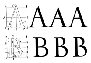
In our Germany . . . are to be found at the present day many young men of a happy talent for the Art Pictorial, who without any artistic training whatever, but taught only by their daily exercise of it, have run riot like an unpruned tree, so that unhesitatingly and without compunction they turn out their works, purely according to their own judgment.
But when great and ingenious artists behold their so inept performances, not undeservedly do they ridicule the blindness of such men; since sane judgment abhors nothing so much as a picture perpetrated with no technical knowledge, although with plenty of care and diligence.
Now the sole reason why painters of this sort are not aware of their own error is that they have not learnt Geometry, without which no one can either be or become an absolute artist; but the blame for this should be laid upon their masters, who themselves are ignorant of this art.
Since this is in very truth the foundation of the whole graphic art, it seems to me a good thing to set down for studious beginners a few rudiments, in which I might, as it were, furnish them with a handle for using the compass and the rule, and thence, by seeing Truth itself before their eyes, they might become not only zealous of the arts, but even arrive at a great and true understanding of them.
Dürer’s book sparked my curiosity, and a very quick subsequent search hinted at the wealth of typographical information online. For example, you can read about The Typography of Advertisements, circa 1911. There you will be warned that bolder is not always better.
“But,” some one says, “the heavier and bolder type-faces furnish a greater contrast to the white of the paper, and therefore should be easier to read.”
It is true that a greater contrast of color is furnished in the use of the bolder type-faces, but to force these greater contrasts on the eye is to literally club it into reading the text, whether or no. Are the salesman’s statements of better selling value because they are shouted loudly in direct contrast to the quiet of the office?
There may be, and undoubtedly are, some on whom this force is necessary, but to those who are sufficiently educated and intelligent to be reached through the appeal of an advertisement, the quiet dignity of the salesman’s statements made in well-modulated tones will be more attractive.
Gaze back even farther, to what was considered Early Typography in 1872. There you will discover a medieval religious order devoted to worship and manuscripts.
Reference has more than once been made to the impulse given to learning at the end of the fourteenth and the beginning of the fifteenth centuries. This movement was helped forward by no one in Holland and Germany more than by Gerhard Groote, or Magnus, of Deventer, (b. 1326, d. 1370), who after studying theology at Paris, became a canon of Utrecht and Aix-la-Chapelle, and founded the Order of the Brethren and Clerks of the Common Life, generally known as the “Gemeiineslebens,” or “Frères de la Vie Commune . . .”
It was divided into the literary Brethren or Clerks, and the unlearned Brethren, who lived in different houses, but in bonds of the greatest friendship. The Clerks devoted themselves to transcribing books, the cultivation of polite learning, and the instruction of youth; and they erected schools wherever they went. The Brethren laboured with their hands, and pursued various mechanic trades. Neither were under the restraint of religious vows; but still they ate at a common table, and had a general community of goods.
There are many other curious titles available to those who choose to explore obscure typography in greater depth. A person might even wish to begin with 1891’s Specimens Of Book, Jobbing, And Ornamental Printing Type In Use In The Government Central Printing Office, Simla [India].
Fonts, fonts, fonts. As I said above, you are fortunate if they don’t draw you too deeply into their orbit. However, if you recognize you too are a fontaholic, take comfort in the knowledge that you are not alone.
* And here’s another font site I had never seen before writing this post. It has a delightful name, Font Squirrel. Once I finish writing this piece, you can guess where I will be spending some of my web surfing research time.
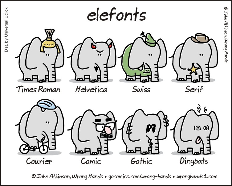
The Elefonts cartoon at the top of the page is a creation of talented Canadian John Atkinson, and is used with permission.

Lewis was a teenaged fan of the original 1906-1928 “flatback” Everyman’s Library design, which had ornate gilt typography on the spine, and endpapers depicting Good Deeds as a graceful woman, and the quotation “Everyman, I will go with thee and be thy guide, in thy most need to go by thy side.” This passage from the late medieval morality play provided Ernest Rhys with the inspiration for the title of a series of good books that almost anyone could afford.
At age 17, Lewis wrote to his best friend:
I wonder how people would laugh if they could hear us smacking our lips over our 7d’s and Everymans just as others gloat over rare folios and an Editio Princeps! But after all, surely we are right to get all the pleasure we can, and even in the cheapest books there is a difference between coarse and nice get up.
– C. S. Lewis to Arthur Greeves, 18 July 1916.
In 1915 he’d recommended the Temple Classics reprints as even better than Everyman editions (1 June). His comment shows him attentive to “the aspect of a typical page, its shape, spacing, lettering etc.” So we see that young CSL cared about fonts!
The Everyman’s Library books were remembered many years later as a good deal.
Richard Church was a critic, biographer, and novelist, a friend of poet Ruth Pitter whose work Lewis so much admired and whom he liked so well. Church wrote three volumes of autobiography, Over the Bridge (1955, winner of the Sunday Times Book Prize for an outstanding work of literature), The Golden Sovereign (1957), and The Voyage Home (1964).
In The Golden Sovereign, Church writes how, around age 21, in 1911, he’d discovered a way to economize on the cost of his daily tram ride, and was pleased because:
“…this economy saved a penny a day. Sixpence a week meant a new volume of Everyman’s Library, or a World’s Classic, every fortnight. And several other such devices might permit me to add a Nelson’s Sevenpenny Classic as well” (p. 4).
In his following autobiographical volume, The Voyage Home, Church wrote about submitting his first novel to:
“….Dents, a house which hitherto I had known mainly as the publishers of Everyman’s Library, that godsend to the impoverished scholar, that friend who had indeed, as the flyleaf of every volume proclaimed, ‘gone with me, to be my guide, in my most need to sit by my side’.
“My first literary prize, won at Dulwich Hamlet School in 1908, for an essay, was the three-volume Shakespeare, bound in sultan-red leather faintly tooled in gold, at eighteen pence a volume. My mother’s last gift to me, two weeks before her death in 1912, had been the works of Macaulay in seven Everyman volumes.
“Everyman’s Library therefore had an emotional as well as a literary appeal to me. I regarded it as almost a private possession, as no doubt did many thousands more like-minded readers avid for knowledge and vicarious living. [Compare CSL above!]
“These associations of our childhood and youth never lose their magic. They remain our secret possessions, and when in later life we happen upon them, the coldness and complexity of our adult condition are put aside. The hopes, the grandeurs and extravagances of the young spirit revive as we touch these tangible relics, to conjure again the certainties of home, the confident mystery of family life, and the first intimations of love for individuals, for vague ideas, for the very concept of home, a wider and more comforting assurance than home itself, the four walls, the mother, the father, and all that surrounded them.
“These emotions revived, therefore, when I posted my typescript to Dents,” etc. (pages 166-167).
The typography was one of the things that made the Everyman’s Library of that day appealing. (There’s an Everyman’s Library today, too, and those books look good, certainly, but they don’t give a good idea of what the original EL volumes looked like.)
For the curious, here’s a look at the Everyman’s Library of Lewis’s day:
http://web.archive.org/web/20100124213326/http://www.kashda.com:80/
everyman/html/everymans.html#vol2
Dale Nelson
Great comment Dale! I have some Everyman editions and treasure them.
Years ago, I examined Margaret Rogers’s “C. S. Lewis: A Living Library” and attempted to make correlations between her list and the old Everyman’s Library. Rogers didn’t indicated the publisher, but if, for example, she lists an eight-volume edition of Hakluyt with the same date(s) as the eight volumes of the Everyman’s Library Hakluyt, it is likely that the books in Lewis’s library were Everyman editions.
The numbers of the Everyman’s Library editions (see previous posting by me) are given so as to correspond with the alphabetical-by-author listing in Rogers’s list.
For Roger’s list, go here:
Click to access Lewis_Library_20171017.pdf
Ready? OK, here goes — the Everyman’s Library books that probably were included in Rogers’s list of Lewis’s books:
458, 10, 520, 170, 287, 99 (seems likely), 11, 283, 223, 570, 701, 353, 468, 715, 567, 467, 355, 356, 506, 83, 295, 264, 265; 313, 314; 338, 339; 388, 389 (these eight are the Hakluyt I mentioned), 176, 122, 459, 405, 406, 310, 691, 66, 552, 572, 101, 20, 732, 678, 734, 179, 482, 718, 96, 676, 683, 684, 210, 211, 212, 129, 133, 134, 135, 137, 139, 140, 144, 616, 95, 589, 44, 455, 368, 70, etc. (not proofread)
Again, please note, I’m not saying that all of these are Everymans, but that, when I compiled this information years ago, it appeared that they -could- be Everyman editions. Even if not all are Everyman editions, the fact that Everyman issued so many such books that Lewis, apparently, found worth having, is suggestive.
Here’s an article about Lewis’s Everyman edition of Phantastes, with photos thereof:
DN
One more Everyman’s Library posting — I hope this does seem relevant to the typography topic. It was the Everyman’s Library edition of the Kalevala (Kirby’s translation), I’m pretty sure, that set off Tolkien’s imagination.
Now that Oronzo Cilli’s Tolkien’s Library is in print, perhaps I will go through it and mark the Everyman’s Library ones.
Note to the prospective purchaser: there is a lot of good information in this book, but its title is misleading. Cilli includes books that Tolkien -mentions-… and these were not necessarily books that Tolkien owned. In some cases he is able to indicate that Tolkien did own that book because it showed up in a bookseller’s catalogue when many of JRRT’s books were sold. But when I got my copy of Cilli’s book, I rushed to see at last which books by Rider Haggard had been owned by JRRT. I was excited to see so many! Then I ran down Cilli’s source for listing them.
It turned out to be myself. My scholarship hadn’t said that Tolkien owned these books but that there was a likelihood that he had read them. Now this IS clear enough from Cilli’s book if you use it cautiously, so this is a good book for those interested in such things, but it will probably get some errors into circulation thanks to people who will use it without the needed attentiveness.
DN
Wow, Dale. That’s a lot of fascinating info. Have you published an article on this subject in the past? Seems like you should. Thank you for sharing these details, particularly as they relate to Lewis, Tolkien and their friends.
What an ironic twist in seeing yourself cited as the source for something subtly misinterpreted like the books in Tolkien’s library. I once wrote a pseudepigraphical document that was clearly that, but mistaken by one university professor for the translation of a genuine (ancient) manuscript.
The information in my first two comments above was set out in some postings at the Pilgrim in Narnia blog a couple of years ago. Years before that, I wrote about CSL and the Everyman’s Library for the New York C. S. Lewis Society.
I went through Cilli’s book Tolkien’s Library today, and though there are a few possibles, the only Everyman’s Library books that I am certain were owned by Tolkien were these two: Sebastian Evans’s translation of the medieval Perlesvaux, as The High History of the Holy Graal (spelled thus) and Lady Charlotte Guest’s translation of the Mabinogion.
DN
After reading your comments I went to the Everyman’s Library website. I was pleased to see they appear to still be a “going concern.”
I am a font nerd. Glad I’m not alone.
You’re definitely not alone.
I like all the classic ones that date back to the Renaissance (if I recall correctly, Bembo is one of those).
I dislike Times New Roman, Comic Sans, and Arial.
I also have a soft spot for Papyrus.
I have mentioned my disconnect with Comic Sans. I went through a phase where I disliked Times New Roman, and often used Palatino in its place. Now I’m back to appreciating its readability and standardization. As for Arial… way too overused (and exceedingly boring).
Durer is very cool. “who without any artistic training whatever, but taught only by their daily exercise of it, have run riot like an unpruned tree, so that unhesitatingly and without compunction they turn out their works, purely according to their own judgment.” That could and maybe should be applied to students who are deprived of all those old handwriting exercises when learning script writing (which is a thing of beauty as well as communication). Enjoyed the quotes.
Fonts are wonderful. Words are important, but also how they are placed on the page (I used to do better with my blog in the early years). Chosen for a reason fonts and blank spaces. All important.
Another fascinating post. Thanks
Durer is one of those historical personages I think it would be fun to know.
You still do a great job with the layout of your blog. (I haven’t noticed and “decline” through the years.) It is a problem, though, when they change internet protocols and software interfaces. I’m still trying to get used to the latest WordPress “upgrade.” By the time I do…
Pingback: Beware of Publishers « Mere Inkling Press
Pingback: Fonts that Can Make Your Literary Dreams Come True – Mere Inkling Press