
 Do you want readers to trust what you write? If so, beware of using common fonts like Arial and Helvetica.
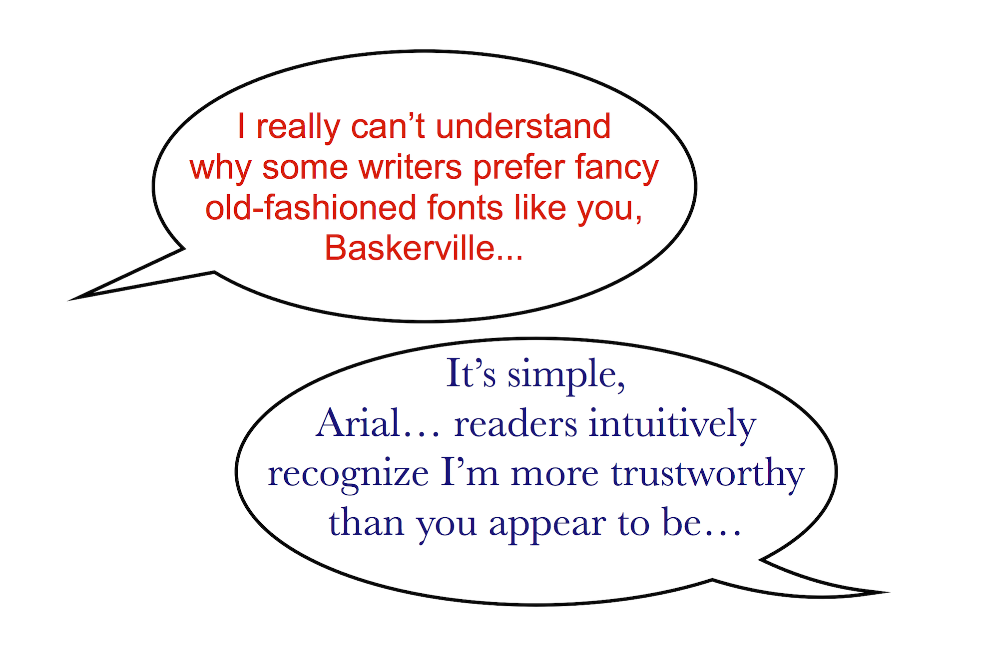
It turns out that serif fonts (those with more traditional finishing strokes) are not simply more legible than their sans serif counterparts.
There is evidence that serif fonts also contribute to the confidence people feel they can place in what they read. You can read a brief account of the research in “Can a Font Make Us Believe Something is True?”
The brief article linked above refers to the results of a study conducted in the New York Times.
The experiment revealed dual effects of using serif fonts. They increased the intensity of agreement with statements, and they reduced the intensity of those who disagreed with the statements.
For many writers, fonts barely register as a consideration. For others, such as yours truly, they are an object of fascination. (Not obsession.) Mere Inkling has approached the subject from a number of angles.
Even if the subject bores or confuses you, it is certainly worth taking note: if you want to enhance the perceived veracity of what you write, avoid the sterile sans serif fonts and stick with more traditional variants.
C.S. Lewis on Trust
It is ironic that a concept so vital as trust receives so little conscious reflection.
We rely on intuition, those proverbial “gut feelings,” to guide in awarding credence to different sources or individuals.
Well, intuition and prejudices.
Sometimes we distrust people because of their professions. Politicians, used car salesmen, and (in recent years) clergy, do not always rank high when it comes to trust. In Surprised by Joy, C.S. Lewis describes his introduction to J.R.R. Tolkien. Though they became close friends, Lewis was initially quite wary.
When I began teaching for the English Faculty, I made two other friends, both Christians [who would play roles in Lewis’ conversion from atheism]. They were H.V.V. Dyson and J.R.R. Tolkien. Friendship with the latter marked the breakdown of two old prejudices. At my first coming into the world I had been (implicitly) warned never to trust a Papist, and at my first coming into the English Faculty (explicitly) never to trust a philologist. Tolkien was both.
Prejudices are part of the human experience. Everyone has them. Wise are those who recognize their own.
Subconscious “prejudices” are more hazardous. Most, fortunately, are of little consequence. In this category I would file the subject of how fonts influence perceptions of truthfulness.
Nevertheless, despite the miniscule influence they may exert, it would be foolish to ignore the evidence that our selection of fonts does matter. It would be foolish to ignore that fact.
Creative writers and publishers have a multitude of fonts to choose from. Making those selections consciously—with an awareness of how they affect readers’ impressions of our truthfulness—is essential.
Postscript – While the content here at Mere Inkling may range across a wide spectrum, one thing you can be sure of. . . the odds of having to endure the Comic Sans* font is almost nil.
_____
*Comic Sans is one of my wife’s favorite fonts. I’m glad for that, because with all of her other amazing traits, I am sometimes tempted to forget she is merely human.

Hmm. I’ve always preferred serif fonts, but I’ve been sending submissions to online publications in sans serif fonts because I thought everyone else preferred those. All right then.
Some editors specifically identify the fonts they prefer (or accept). Staying within the standard boundaries is wise if they don’t. But, as you say, switching to a common serif font should not cause you any problems.
And no bubble letters! (with or without heart shaped “dots” over i’s)
Wonder if people subconsciously connect serif fonts with those solid Roman or Greek architecture/columns?
Intriguing
The stats don’t show an huge difference in perceptions. However, it is measurable–and real. Even if this factor only affects 2% of readers, that would be 2%. (Don’t know how it would calculate out in real numbers.)
My curiosity relates to the age of the reader. I would think this is truer for more “mature” readers and that “kids” have been growing up on a steadier diet of sans serif. Even if that idea is accurate, it would not necessarily follow, of course, that the younger readers would not share the perception of their seniors.
Can always tell one who deals with research and details – Age / generation (the influx of Asian illustrations/graphic novels, too?) is a real variable for this one….sounds like a graduate thesis possible there for someone…and for marketing departments
(Some of us are so easily amused and intrigued…fun.)
Easily “amused” and (in my case, at least) easily distracted from more important tasks at hand.
I saw another article this week talking about how much more trustworthy serif fonts are. Interesting coincidence.
But, when I was setting up my website, I wanted to go for kid-friendly. I found one of the few free fonts with a circular “a”, but it’s a sanserif. Have I been short changing myself all this time?!!!
Or, can there be a message more important to give out than “trust” especially since I’m trying to establish more of a peer-to-peer connection?
BTW I’m rather fond of Comic Sans myself, but it reminds me of the early internet too much now. :D
My wife claims that Comic Sans is superbly readable for her (high school) SPED students… but I think that’s merely a rationalization, since she likes it so much!
Interesting. The Wall Street Journal advised job seekers to use Helvetica since that is the preferred font for HR resumes.
I’m not surprised. Different fields may normalize different fonts. I suspect that the key is not using a font that draws attention to itself.
Interesting. I prefer sans serif for reading speed. I can read Arial or Calibri text MUCH faster than a serif font. Maybe serif strokes are like speed bumps to my eyes.
Ironic. Your email with the first bit of your post comes through as sans something. (Made me actually laugh out loud!) Same for this field as I type. But when I hit the “post” button, presto chango! Suddenly my comment is much more believable in TNR! (Besides, it’s on the Internet, so it must be true now!)
That’s funny about the way my post came through without serifs. However, I’m sure that’s due to your email defaults since, as you say, you prefer that sort of font.
I love your comment about the simple fact your/my words are hear on the internet makes them true. It reminded me of this amazing ad from a couple years ago…
That’s hysterical!
Incidentally, there is probably a setting somewhere on my computer that controls the incoming message font, but I couldn’t find anything in the email options. I did find out how to change the font when I write an email…. and many other options I didn’t know existed! :-)
The problem with learning all the intricacies of your email program is that–just like all software–it will be revised in a new version that drops all the features you love just when you have mastering it within your grasp.
“At my first coming into the world I had been (implicitly) warned never to trust a Papist, and at my first coming into the English Faculty (explicitly) never to trust a philologist. Tolkien was both.” I’ve loved this line ever since I encountered it. Lewis does have a way with words. .
Yes, he does. And this is a very memorable line because he found his prejudices totally upended. Now, if they had been reinforced by his association with a particular individual, it’s not something we would be likely to regard so fondly.
I knew there was a reason I submitted my poems to publications in Times New Roman, even when that font wasn’t specified.
You see, you knew intuitively it was the wisest (safest) choice. Much better than avant garde, which is a dramatic font with its own sans serif flair…
Interesting. I definitely prefer reading books in serif fonts. :)
No surprise there… I (subconsciously) find them to be more trustworthy, myself!
Pingback: The Ugliest Book « Mere Inkling
Pingback: Historical Font Facts « Mere Inkling Press
Pingback: Legal & Illegal Fonts « Mere Inkling Press
Pingback: We Are All Hard of Hearing « Mere Inkling Press
Pingback: Elven Inspiration from Space – Mere Inkling Press
Pingback: Fonts that Can Make Your Literary Dreams Come True – Mere Inkling Press