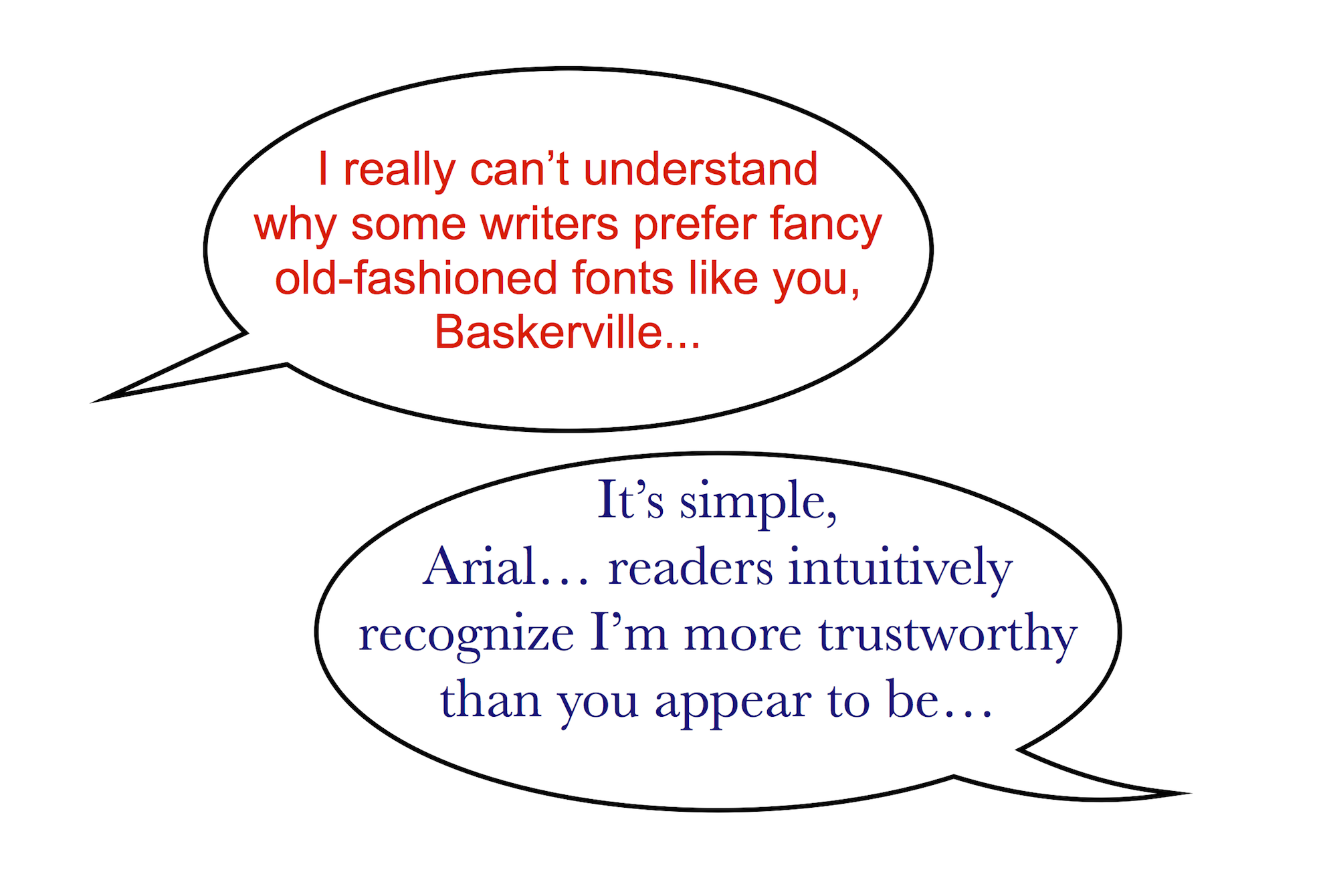
 Do you want readers to trust what you write? If so, beware of using common fonts like Arial and Helvetica.
It turns out that serif fonts (those with more traditional finishing strokes) are not simply more legible than their sans serif counterparts.
There is evidence that serif fonts also contribute to the confidence people feel they can place in what they read. You can read a brief account of the research in “Can a Font Make Us Believe Something is True?”
The brief article linked above refers to the results of a study conducted in the New York Times.
The experiment revealed dual effects of using serif fonts. They increased the intensity of agreement with statements, and they reduced the intensity of those who disagreed with the statements.
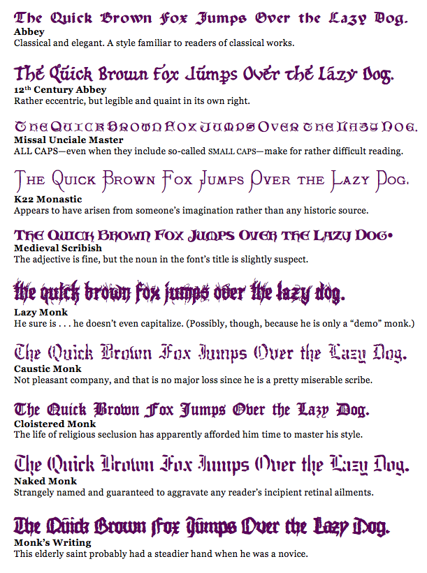
For many writers, fonts barely register as a consideration. For others, such as yours truly, they are an object of fascination. (Not obsession.) Mere Inkling has approached the subject from a number of angles.
Even if the subject bores or confuses you, it is certainly worth taking note: if you want to enhance the perceived veracity of what you write, avoid the sterile sans serif fonts and stick with more traditional variants.
C.S. Lewis on Trust
It is ironic that a concept so vital as trust receives so little conscious reflection.
We rely on intuition, those proverbial “gut feelings,” to guide in awarding credence to different sources or individuals.
Well, intuition and prejudices.
Sometimes we distrust people because of their professions. Politicians, used car salesmen, and (in recent years) clergy, do not always rank high when it comes to trust. In Surprised by Joy, C.S. Lewis describes his introduction to J.R.R. Tolkien. Though they became close friends, Lewis was initially quite wary.
When I began teaching for the English Faculty, I made two other friends, both Christians [who would play roles in Lewis’ conversion from atheism]. They were H.V.V. Dyson and J.R.R. Tolkien. Friendship with the latter marked the breakdown of two old prejudices. At my first coming into the world I had been (implicitly) warned never to trust a Papist, and at my first coming into the English Faculty (explicitly) never to trust a philologist. Tolkien was both.
Prejudices are part of the human experience. Everyone has them. Wise are those who recognize their own.
Subconscious “prejudices” are more hazardous. Most, fortunately, are of little consequence. In this category I would file the subject of how fonts influence perceptions of truthfulness.
Nevertheless, despite the miniscule influence they may exert, it would be foolish to ignore the evidence that our selection of fonts does matter. It would be foolish to ignore that fact.
Creative writers and publishers have a multitude of fonts to choose from. Making those selections consciously—with an awareness of how they affect readers’ impressions of our truthfulness—is essential.
Postscript – While the content here at Mere Inkling may range across a wide spectrum, one thing you can be sure of. . . the odds of having to endure the Comic Sans* font is almost nil.
_____
*Comic Sans is one of my wife’s favorite fonts. I’m glad for that, because with all of her other amazing traits, I am sometimes tempted to forget she is merely human.