Damnable Typos & the Bible

While the title of this post will be shocking to some, it’s far less scandalous than the typographical error discussed below. Due to two misprints appearing in a 1641 edition of the King James Bible (KJV), the publication has been labeled the “Wicked Bible.”

Translating the Scriptures is a necessary, and demanding, task. The early editions of the KJV (which was preceded by the Wycliffe Bible) reveal how vulnerable the words themselves were to being altered during the typesetting process.

I’ve written about this subject a number of times during the past decade, and even devoted a column to “C.S. Lewis’ School of Translation,” which is about something even more important than merely translating words. There I quote one of the great author’s deepest hopes.

What I want is to be the founder of a school of ‘translation . . .’ Where are my successors? (correspondence, 7 October 1945).

Returning to the seventeenth century book with its unfortunate errors, we witness an example of how even a solid translation can be derailed by careless (or malevolent) typesetters.

The magnitude of the mistake discovered in this particular edition caused its suppression, and most copies were destroyed. While some still exist in private hands, only fifteen remain in public collections. One of these made its way to New Zealand before being identified in 2018.

A Truly Scandalous Misprint

It would be one thing if a printer accidently dropped the final “e” from “breathe,” leaving the word “breath.” Even substituting an errant “w” for the “b,” would create an alternate word that would greatly muddle a passage . . . but still not appear remotely “wicked.” 

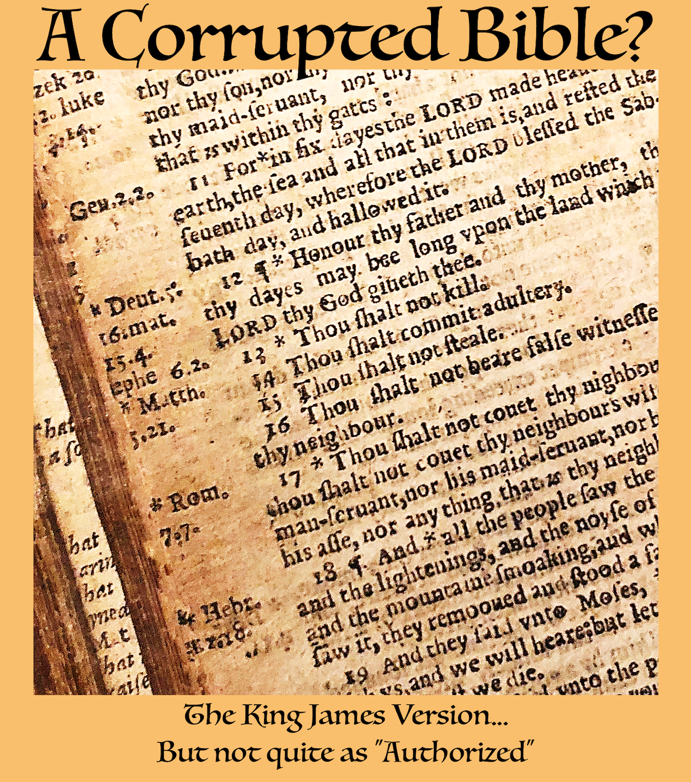
However, a 1631 mistake in an English Bible literally turned a passage – one of the Ten Commandments, no less – on its head. Rather than reading “Thou shalt not commit adultery,” this edition declares, “Thou shalt commit adultery” (Exodus 20:14).

The consequences of this disaster were significant, particularly for His Majesty’s official printers. In Cyprianus Anglicanus by royalist priest Peter Heylyn (1599-1662), we learn the details. (You can download a free facsimile of the volume which includes many other fascinating facts.) The passage related to the misbegotten tome reads as follows:

His Majesties Printers, at or about this time [1632], had committed a scandalous mistake in our English Bibles, by leaving out the word Not in the Seventh Commandment.

His Majesty being made acquainted with it by the Bishop of London, Order was given for calling the Printers into the High-Commission where upon the Evidence of the Fact, the whole Impression was called in, and the Printers deeply fined, as they justly merited.

Reports of Cases in the Courts of Star Chamber and High Commission, penned by Samuel Rawson Gardiner in 1886, includes a detailed account of the court’s findings. (Due to their uniqueness, I have transposed the full account, as found in two sections, as a footnote below.) One passage describes a second “gross error.”

. . . showed the two grossest errors, vizt. “Shalt commit adultery” and “great asse:” for “shalt not commit adultery” and “greatnesse…”

The second of these blunders occurs in Deuteronomy 5:24, which properly reads “Behold, the Lord our God hath shewed us his glory and his greatness.” (It should be noted that the word asse would most commonly be associated with donkeys.)

The magnitude of these mistakes can only be understood when one recognizes how reverentially the Scriptures were regarded at this time. C.S. Lewis would suggest that during an age when the Bible has been relegated to historic literature, it is difficult for us to comprehend the seriousness of this matter.

It is very generally implied that those who have rejected its theological pretensions nevertheless continue to enjoy it as a treasure house of English prose. It may be so. There may be people who, not having been forced upon familiarity with it by believing parents, have yet been drawn to it by its literary charms and remained as constant readers.

But I never happen to meet them. Perhaps it is because I live in the provinces. But I cannot help suspecting, if I may make an Irish bull, that those who read the Bible as literature do not read the Bible. (“The Literary Impact of the Authorised Version”).

In “Challenges in Printing Early English Bibles,” you can read about other Bibles featuring noteworthy mistakes. In two, “peacemakers” become “placemakers,” and “murmurers” are transformed into “murderers.” Another example, in the very first edition of the KJV, finds Jesus’ ancestor Ruth referred to by the male pronoun, due to the accidental dropping of an “s.”

More troubling is another early KJV Bible where “the text of Psalm 14 [reads], “The fool hath said in his heart there is a God,” rather than “The fool hath said in his heart there is no God.”

Worst of all, in terms of blasphemous connotations, would likely be the so-called “Judas Bible.”

In the 1609 Geneva Bible, the typesetters mistakenly replaced Jesus’s name with that of Judas. John 6:67 reads: “From that time many of his disciples went back, and walked no more with him. Then said Judas unto the twelve, Will ye also go away?”

Fortunately, modern editions of the Jewish and Christian Scriptures undergo thorough proofreading, so this sort of error is rare today. Still, typos will persist as long as the remotest possibility of error exists.

Those among us who have sought to have our writing published by traditional publishers may relate to the example with which we end. C.S. Lewis and J.R.R. Tolkien and even Mark Twain faced challenges working with some of their editors and publishers.

With all of the printing mishaps in the early English Bible, it is only appropriate that one of the editions was called “The Printers Bible.”

This text, published in about 1702, takes its name from a typesetting error found in Psalm 119, which should have read “Princes have per­secuted me without a cause” but was mistakenly printed as “Printers have persecuted me.”


Full references from Reports of Cases in the Courts of Star Chamber and High Commission by Samuel Rawson Gardiner (1886).

Mr Barker the printer. There is a cause begunne against him for false printeing of the Bible in divers places of it, in the Edition of 1631, vizt., in the 20 of Exod[us], “Thou shalt committ adultery”; and in the fifte of Deut[eronomy] “The Lord has shewed his glory, and his great asse”; and for divers other faults; and that they had printed it in very bad paper. And the Bishop of London showed that this would undoe the trade, and was a most dishonorable thing; that they of the church of Rome are soe carefull, that not a word or letter is to be found amisse in their Ladie’s Psalter and other superstitious books; and that we should not be soe carefull in printinge the sacred Scriptures; and that they in Holland, at Amsterdam, had gott up an English presse, and had printed the Bible in better paper, and with a better letter, and can undersell us 18d. in a Bible. Mr Barker and his partners endeavored in partt to excuse themselves, and had advocates to speake for them, and were willing to submitt, and promised to amend their faults; but the Court would not remitt their offense, but the cause was ordered to goe on.

The Printers having answered move the Court to passe by their oversight being the fault of the workmen but the King’s Advocate desired they might make their defense legally and the cause to go onto hearing: and that he might have liberty to put in additional articles against them. The Bishop of London would have the Church sett upright in her reputacion, that we are as carefull in printeing the Bible as they are of their Jesus’ psalter : and whereas the Printers say this is stirred up by the malice of one man against them; The Bishop saith he stirred not till the Bible was sould into his house, bought by his footman: and he saith the printinge is soe bbad and the paper too that, if it be not mended shortlie, they wilbe put downe by those of Amsterdam and their trade spoyled, and showed for the two grossest errors, vizt. “Shalt commit adultery” and “great asse:” for “shalt not commit adultery” and “greatnesse…” The Arch Bishop of Canterbury saith, that the Printers that print for his Matie have a very profitable place, and therefore should be more carefull. I knew the tyme when greater care was had about printeing, the Bibles especiallie, good compositors and the best correctors were gotten being grave and learned men, and the paper and letter rare and faire every way of the best; but now the paper is naught, the composers boyes, and the correctors unlearned: There is a farmer and he makes the benefit, and careth for nothing about it. They heretofore spent their whole time in printeing, but these looke to gaine, gaine, gaine, then they are not to be commended: Well, let them looke to it: and let the cause proceed, saith the ArchBishop. London. “There was a great deale of doo between you of this Citty and those of Cambridge heretofore about the priviledge of printeing the Bible and psalms which they of Cambridge claymed; then the Bible was exactlie printed, now you have forced the Cambridg printer to an agreement, now noe bible is right printed.

[It appears this volume itself would have benefited from having more diligent “correctors.” Perhaps most curiously, two spellings of the word printing – “printinge” and “printeing” – appear in this publication.]

Tinker Bell, the Inklings, and Disney

Poor Tinker Bell. The political prejudices of our day have caught up with the sparkling fairy, and relegated her to a significantly reduced presence in the Disney universe.

Inside the Magic reported “Tinker Bell seems to have left Walt Disney World and is now on her way back to Neverland following a recent change at Walt Disney World Resort.” You can read the tragic tale on their site.

. . . once more, Disney’s animated classic, Peter Pan (1953), is under scrutiny, with Disney issuing a statement regarding Captain Hook and Tinker Bell as characters with potential concerns.

Linking poor Tink to a murderous pirate seems a bit of a stretch, and she has not been fully banished, but she has definitely been demoted. According to TMZ, Disney alleges the company’s “own people felt she wasn’t a good role model for girls in the 21st century.”

Well, eventually she too will be in the public domain, like Mickey Mouse. Actually, her literary portrait as introduced in the play, coincidentally just entered the public domain this year (2024)!

However, should you reside in the United Kingdom, beware that in 1988, the copyright holder, Great Ormond Street Hospital, was granted the rights to Peter Pan “in perpetuity.”

The Creator of Tinker Bell & Peter Pan

Tinker Bell is one of the most memorable characters in Neverland, the creation of James Matthew Barrie (1860-1937). He was a prolific Scottish writer and is best known for his 1911 novel, Peter and Wendy – which initially debuted in the form of a stage play in 1904, as Peter Pan; or, the Boy Who Wouldn’t Grow Up.

Peter Pan was actually introduced to the world as a baby in The Little White Bird. Tinker Bell does not appear in the novel, but the following description of J.M. Barrie’s fairy mythology is quite fanciful.

One of the great differences between the fairies and us is that they never do anything useful. When the first baby laughed for the first time, his laugh broke into a million pieces, and they all went skipping about. That was the beginning of fairies.

They look tremendously busy, you know, as if they had not a moment to spare, but if you were to ask them what they are doing, they could not tell you in the least. They are frightfully ignorant, and everything they do is make-believe.

They have a postman, but he never calls except at Christmas with his little box, and though they have beautiful schools, nothing is taught in them; the youngest child being chief person is always elected mistress, and when she has called the roll, they all go out for a walk and never come back.

It is a very noticeable thing that, in fairy families, the youngest is always chief person, and usually becomes a prince or princess; and children remember this, and think it must be so among humans also, and that is why they are often made uneasy when they come upon their mother furtively putting new frills on the basinette.

Barrie continues, describing how infants are simply following fairy “ways” when they misbehave, and they naturally experience “exasperation, because we don’t understand [them], though [they are] talking an intelligible language . . . fairy.”

Returning to the person of Tinker Bell herself, she outgrew her supporting role as, in the words of her creator, “a common fairy.” She was literally a tinker, who died following the departure of Wendy and her brothers from Neverland. 

Presumably, some of the gatekeepers at Disney would have preferred that the affection of the crowds had not restored her to life. 

The Inklings

The Imaginative Conservative offers an interesting take on C.S. Lewis’ view of fairies. I quote a portion related to our present subject.

Lewis treats the subject of fairies in . . . The Discarded Image. . . . After explaining the medieval understanding of the heavens and planetary systems, Lewis turns to what he calls the Longaevi. He avoids the term “fairies” because it is “tarnished by pantomime and bad children’s books with worse illustrations.” (Probably referring to Barrie’s popular play and Princess Mary’s Gift Book – the book from which Elsie and Frances clipped the pictures they used in their fake photos.)

Jane Douglass, an American actress and playwright, contributed a fascinating essay to C.S. Lewis at the Breakfast Table, and Other Reminiscences. One wonderful portion of “An Enduring Friendship” describes Lewis’ thoughts about the possible dramatization of The Lion, the Witch, and the Wardrobe

C.S. Lewis deemed the prospect absurd on its face, saying “I believe plays should be plays, poems, poems, novels, novels, stories, stories, and certainly the book you mention is pure narrative.” So much for a partially surviving 1967 series, the 1979 animation, the 1988 BBC television series, and the cinematic version(s) which began in 2005. Oh, and there is the matter of the impending Netflix telling which remains a closely guarded secret. Douglass continued with a reference to Disney.

He repeated his dread of such things as radio and television apparatus and expressed his dislike of talking films. I said I quite understood this, and that nothing would distress me more than that he should think that I had in mind anything like the Walt Disney shows; I hoped nobody had suggested the book to Mr. Disney.

This seemed to relieve Mr. Lewis to such an extent that I thought perhaps Mr. Disney had been after the book, but of course I did not ask. And in his usual generous way, Mr. Lewis said, “Too bad we didn’t know Walt Disney before he was spoiled, isn’t it?”

Author Jim Denney has a nice article on “What C.S. Lewis and J.R.R. Tolkien Thought of Walt Disney” in which he describes parallels between the live of Lewis and Disney and concludes, “you might think that, with all that C.S. Lewis and Walt Disney had in common, they might have been mutual admirers – but that was not the case.”

Disney’s Snow White and the Seven Dwarfs debuted in the United States in 1937 and in the United Kingdom in 1938. . . . A few months later, Lewis went to see it again, this time with his good friend (and fellow Oxford professor) J.R.R. Tolkien.

Coincidentally, Tolkien’s first novel The Hobbit had been published in September 1937, just three months before the American debut of Snow White.

Their greatest disappointment was in Disney’s utterly comical take on dwarves and the absence of the slightest air of “the mythic nobility of the dwarves from Germanic folklore.”

Although Snow White is itself a fairy tale, fairy characters are not to be found in the film. In the same way, J.R.R. Tolkien referred to the Lord of the Rings as a “fairy story” for adults, yet they do not appear to dwell in Middle Earth.

In fact, according to The Encyclopedia of Arda, “the name ‘Faerie’ belongs to an early period of Tolkien’s writings, and is never seen in The Lord of the Rings, but it does survive in a single usage in the earlier book The Hobbit.” And even in that case, it refers not to a population, but to a place.

On the Effect of Tinker Bell

Tinker Bell’s significance in the world is not confined to literature, or the interests of children. There is a brilliant application of her legend which has been transposed into the psychological realm. 

It’s call the “Tinker Bell Effect,” and “Be(lie)ve It or Not,” from Psychology Today, offers the following description.

One theory manifesting connections among belief, psychology, and mythology is the Tinkerbell effect named for the fairy Tinker Bell of Peter Pan whose resuscitation depends upon the audience expressing their belief in fairies through clapping . . .

The Tinkerbell effect refers to those things that exist only through imaginative acts and because people believe in them. The Reverse Tinkerbell effect maintains that, somewhat paradoxically, the more people believe in something the more likely it is to disappear. 

In their article, the psychologists parenthetically offer an additional application of Tinker Bell’s nature to their area of study. (It actually appears in the paragraph above, where I replaced it with an ellipsis.)

(because she is so small that she can only hold one feeling at a time, Tinkerbell is also a model for mood disorders and difficulties with emotional self-regulation)

Fascinating. It seems to me this insight opens the door to further literary exploration of the Tinker Bell Phenomenon that would be of interest to writers and literary critics alike. I close with my proposal for a new label for an ancient plague afflicting fictional works. If it interests any scholars among you, I invite you to develop it further and claim it as your own.

Tinker Bell (var. Tinkerbell) Crippling Character Creation Complete Content Complexity Phenomenon: The invention of fictional characters who lack depth and bear no resemblance to real people. Literary tropes that are often referred to as one-dimensional or “flat” characters. (See nearly all Marvel supervillains.)

P.S. – Feel free to abbr. the admittedly verbose proposed title; keeping in mind most readers prefer brief reads.

An Interstellar Accomplishment

Whoever says “getting there is half the fun” is not referring to the arduous journey undertaken by writers seeking publication.

We writers – I say “we” because odds are you share my literary interests – we writers believe we have something to say that is worth hearing. Something that can genuinely benefit others.

That’s why we undertake the labor of writing, often without any financial reward. That’s why we risk revealing ourselves, becoming vulnerable to criticism and even ridicule.

This desire to share is why we invest the time and emotional energy required to imprint our thoughts and feelings on paper, literal and digital. It’s also the reason we strive to improve our literary skills. Writing well, is not easy.

Some writers enjoy the actual process of writing, but for many of us it is too akin to “work” to be considered fun. A decade ago, I wrote about “The Satisfaction of Writing.” 

In the post I confessed I don’t find the writing process all that grand. It was enlightening when I realized it’s not writing I enjoy, but the “satisfaction of having written.” And, having something published multiplies that level of satisfaction, particularly when what I have written finds a home in a publication edited by others.

And that brings me to my good news.

My Recent Publication

This week I received a complimentary copy of a new volume published by Rowman & Littlefield, an academic publishing house.

Theology and Star Trek gathers a group of scholars from various religious and theological disciplines to reflect upon the connection between theology and Star Trek anew.

Among the twenty chapter essays included in the volume is one written by yours truly. In “Starfleet’s AWOL Chaplain: Why Star Trek’s Federation Lacks Chaplains,” I explore Gene Roddenberry’s firm rejection of chaplains in his fictional universe.

I have been a fan of Star Trek ever since I watched the first episode of the original series air on September 8, 1966. And I am extremely proud to have contributed a chapter to Theology and Star Trek.

Allow me to share with you an insight I gained from this experience. It has to do with the project’s extended timeline. Admittedly, part of the delay was apparently caused by the covid epidemic, but even without that interruption, it takes a long time for an academic collection such as this to finally see print.

In October of 2018, I learned about the project and submitted an initial proposal for inclusion in the book. On New Year’s Eve I received acceptance of the proposal and an invitation to submit a “manuscript of approximately 5,000 words” by the first of May 2019. Deadline was extended to June first. First draft was mailed to the co-editors. After my extensive research, the manuscript numbered an immodest 17,442 words.

On July first I accepted the invitation to abbreviate my manuscript, which might be published in some future day, in an appropriately independent version as “a short book.” Revised chapter forwarded on 11 July: “Full word count now is 5549, but since 1528 are in the endnotes, the actual text for the chapter is only 4011, of which 169 constitute the abstract.”

Nearly a year later, on June 9, 2020, I received editorial suggestions from the editors and on June 30, 2020 I submitted my edited chapter. On September 11, 2021, the editors apologized for delays and said they were sending all of the essays out for peer review. On  June 11, 2022 I inquired with the editors as to whether the project may have been dropped, and was pleased to learn that it was still underway. The editor said the essays had been returned to writers to incorporate peer review comments. Since my essay had “only minor comments,” they were able to amend it without involving me. 

In July 2022 we worked together online with the Index, and reviewed our bio entries for the volume. On March 17, 2023 the publisher’s proofs for Theology and Star Trek were available for our personal review of our essays. April 11, 2023 marked completion of the corrected proof copy, and we added the actual pages for each of the subjects we had added to the index. Sent my final confirmation of the indexing, noticed a minor error in my chapter that was too late to fix, and waited for the arrival of my copy of the finished work . . . which arrived slightly under five years after I asked to join the project.

Lessons learned: (1) be more conscientious about meeting the word length guidelines, (2) be patient, and (3) remain patient.

Even as I share this extended timetable, I’m conscious of the fact I am no expert on the subject. I feel a bit like the people to whom C.S. Lewis referred in a 1952 letter to his publisher, Geoffrey Bles.

I often smile when I compare my ignorance with the knowingness of some people who, on the strength of having published one book, seem to have the whole mystery of publishing, printing, & binding by heart.

Advice to Writers

If you’ve followed Mere Inkling for a while, you’re aware I occasionally offer modest writing tips. 

Two years ago I wrote a post entitled “Are You an Author or an Editor?” In it I discussed some distinctions between different aspects of our writing lives. In “C.S. Lewis and the Oddities of Editors,” I highlighted that great author’s amazement at the arbitrary decisions made by editors.

I discussed a skill I have never mastered in “Brevity & Clear Communication.” In “Does Sincerity Result in Good Writing” I discussed C.S. Lewis’ thoughts about The Pilgrim’s Progress.

In “On Choosing Between a Child and a Book,” I even addressed the delicate subject of whether an individual would prefer to leave a book, rather than a child, as their legacy. Several more articles on related subjects are linked here.

A Word of Encouragement

Sadly, many aspiring writers feel like they will never “arrive” – in terms of seeing their words in “traditional” print. We must, nevertheless, remain persistent since, if we quit writing, that end is all but guaranteed.

However, when we read widely, and physically sit down with pen or keyboard, our chance of seeing our name in print rises geometrically. When we continue to study the art of writing and when we continue to sharpen our skills by stretching beyond our comfort zones, our efforts are often rewarded.

The internet abounds with stories of people who were not published until late in life. And there are many whose work only gained fame after their deaths.

Some popular writers, including C.S. Lewis and J.R.R. Tolkien, were prolific. They enjoyed some renown during their lives, but have only grown in their popularity posthumously. Many writers have left unfinished projects which have been published after their passing. In the case of these Inklings, this effort was spearheaded by Lewis’ secretary Walter Hooper and Tolkien’s son Christopher.

Waterstones, the British bookseller,  goes so far as to say “J.R.R. Tolkien is arguably one of the most posthumously-published authors there has ever been. The Silmarillion was compiled from notes he left behind, likewise The Children of Hurin and, in 2014, Tolkien’s prose translation of Beowulf was released.”

It may be unlikely that you are I will have anything published after our life ends. But, the words we pen might one day prove a blessing to others in a future family memoir. 

I encourage you to continue to write, whether publishers reinforce you or not. However small your audience may seem, virtually everyone recognizes there is value in expressing ourselves in this way. 

And, may the cost of your literary labors be outweighed by the satisfaction you gain as its reward.

Star Trek Postscript

Yes, if you check out the publication site, you will see that my name is listed last among all of Theology and Star Trek’scontributors. Even if this isn’t a consequence of alphabetical considerations, I’m not bothered. My simple inclusion in the volume is sufficient . . . and we struggling writers must never forget the words of Matthew 20:16.

Judging by Appearances

If books should not be judged by their covers, how much more true is it that we should avoid judging people by their initial appearance?

We don’t want others to be hasty in determining who we are, right? We need to take some time to get to know people before coming to “conclusions” about what they are like.

Yet we still tend to look at someone and – right away – assess whether they are trustworthy or not. I confess it is sometimes challenging for me to maintain an open mind. For example, teardrop tattoos (especially when accompanied by neck ink that combines letters and numbers), make me nervous.

First impressions are usually by their very nature superficial. Which means they often prove to be wrong. That’s true about people . . . and books.

Lewis scholar Dale Nelson recently sent me an interesting review of the book The Inklings, written by Humphrey Carpenter in 1978. The fascinating thing about the piece was that it was written by Lord David Cecil (1902-1986), who was himself an Inkling.

One of the things which drew my attention was his physical description of several of the members, especially C.S. Lewis. Without citing the maxim, he declares how misleading first impressions may be.

[Charles] Williams was the most obviously odd. Very tall, and indisputably ugly with a high forehead and with gleaming spectacles, he yet diffused a curious charm that came from an enthusiastic warmth of spirit united to a comic lack of inhibition. . . .

Lewis at first sight appeared less unusual; stocky, red-faced, loud-voiced, he might indeed have been taken for an innkeeper or even a butcher.

Such a mistake would not have displeased him, he liked to think of himself as representing the common man, in contrast to the sophisticated intellectual.

These observations were interesting, but there was something far more thought-provoking in the (excellent, by the way) review. More about that in a moment. First let’s return for a moment to the issue of book covers.

What about the Cover of the Book You are Writing?

I discussed covers, and Lewis’ thoughts thereon, in this post.

It’s unsurprising that with all of their many reprintings, the writings of C.S. Lewis have been published with a wide range of covers. Some of this can be attributed to the artistic fads of the decade in which particular editions saw print. More important, I believe, are the arbitrary tastes of publishers.

When it comes to self-publishing, authors are in complete control over the image that graces their literary creations. While I make no pretense of being an artist, I must confess at being shocked by the shoddy quality of many such works. Surely they are aware that the very best of writing can be marred by dreadful packaging. By the same token, even weak literature has received wider dissemination than it merited, due to stunning or alluring graphics.

The internet is filled with posts on this subject. These are representative:

Against Popular Advice, Books Continue to Be Judged by Their Covers” says, “for some, this can be a bitter pill to swallow, because writers want to believe that their work will speak for itself.”

The reality is that every person who steps into a book shop or browses books online is judging books by their cover, even if only subconsciously. I’m not saying that the judgment is always correct. Some books have amazing covers but are comprised of some pretty bad writing. I’d guess that many more amazing books are hiding behind bad cover art. The challenge is to get readers to pick up your book in the first place. That’s where the artwork comes in.

Another writer contends that potential readers do consider a host of matters. In “Why ‘Don’t Judge a Book by its Cover’ is Bad Advice,” the writer nevertheless admits it is the single most important element in winning an audience (short of a celebrity endorsement).

Readers are going to keep on reading and judging based on a whole host of criteria. The cover is just one of the many factors that are taken into account. Like other aspects of a book, it holds valuable information about the story kept inside.

Disregarding it is bad advice. Instead, why not try judging a book by its cover? Maybe next time you peruse the shelves of your neighborhood bookstore or scroll through the numerous titles listed online, you can select books purely based on the cover.

You never know, that could tell you everything you need to give that book a chance.

Covers are not the only factor in enhancing your book’s reception. Consider as well the nature of the paper in printed copies, as I discussed in “The Ugliest Book,” about a Mayan codex.

Now, back to the book reviewer.

David Cecil’s Thoughts on His Own Identity as an Inkling

After graduating from Oxford, Cecil briefly taught Rhetoric in London, before returning to Oxford, where he taught English. During his career, he wrote various works, including a number of literary biographies. These include: The Stricken Deer or The Life of Cowper, English Poets, Hardy the Novelist.

David Cecil was an accomplished man, and a true Oxford Inkling. The curious aspect is how, as the son of a marquess (bearing a courtesy title), socializing with a different caste, so to speak, would bond so well with the rest of the Inklings. Fortunately, Cecil briefly explains why he valued the fellowship in this book review.

Usually one of them would read aloud a piece from some book he was writing. . . . The meetings were also occasionally attended by persons who did not share The Inklings’ distinctive point of view but who liked spending an evening in their company.

I myself was one of these; I found such evenings enjoyable and stimulating; and all the more because the spirit of The Inklings was in piquant contrast to those of the Oxford circles in which I spent most of my time.

A final gift to those who treasure Lewis and his companions comes in Cecil’s incisive understanding of their unifying bond.

The qualities . . . that gave The Inklings their distinctive personality were not primarily their opinion; rather it was a feeling for literature, which united, in an unusual way, scholarship and imagination.

Their standard of learning was very high. To study a book in translation or without a proper knowledge of its historic background would have been to them unthinkable; they were academic in the best sense of the word.

But – and this is what made them different from most academics – they also read imaginatively. The great books of the past were to them living in the same way as the work of a contemporary. . . .

Simply they read their books in the spirit in which they were written. And they could communicate their sense of this spirit to their hearers so that, for these also, these great books sprang to fresh, full life.

This was a unique achievement in the Oxford of their time.

It appears the Inklings would be among the last to judge a book, or a person, by their cover.

Beware of Publishers

You can write a masterpiece, only to have it ruined by an inattentive publisher.

It would be bad enough if they filled your retelling of Romeo and Juliet with typos, what if you had just penned the ultimate authority on grammar, or perhaps, spelling?

Last month, British lexicographer Susie Dent released Word Perfect, a “brilliant linguistic almanac.” Unfortunately, the wrong (pre-proofed) version was published, and it was anything but “perfect.”

Although thoroughly embarrassed, Dent was gracious in regard to the error. “To be fair to my publishers, Covid has caused an extraordinary rush on pushing books through the production process, and in many ways it has been a laudable achievement getting anything published at all.”

Many of Mere Inkling’s readers are also writers. Some are fortunate enough to have professional publishers. Dent reminds us that we should not take them for granted, despite their occasional shortcomings.

C.S. Lewis was, of course, quite a prolific writer. This led to his interaction with a variety of different editors. Lewis freely expressed appreciation for a job well done, as I noted in his praise of a French translation of his work.

Lewis was also quite comfortable in discussing precisely how his writings should appear in print. In another post, I described his conversation with a publisher about the presentation of a Shakespearean quotation.

Similarly, Lewis possessed an awareness of the importance of the covers chosen for his books. And he lamented the quality of the paper dictated by wartime rationing.

Mere Inkling has included many other references to publishers in the past, although I am still searching for an ancient roman reference to Cave Scribae.*

Publishers and editors are often the targets of disaffected writers. If you have never seen Mark Twain’s delightful sketches on the subject, don’t shut down your computer before checking my post on the subject.

It would be good to pray that our personal attitudes towards publishers reflect those of C.S. Lewis and Susie Dent rather than Samuel Clemens, since Twain once summarized his attitude in this tragic manner:

If ever a publisher gets a non-terminable contract with an author, that author can never buy his freedom from that slavery on any terms. A publisher is by nature so low and vile that he—that he—well from the bottom of my heart I wish all publishers were in hell.


* Cave Scribae translates to “Beware of the Scribes.” It’s a reference to the ancient practice of publishers having scribes reproduce individual copies of a new work for sale or distribution. Since each copy was technically “unique,” one can only guess how many errors must have slipped surreptitiously into the duplicates.

As for the illustration at the top of this column, there are countless examples of similar mistakes online. They are particularly alarming when they come from “educational” institutions. This one, from Oregon State University, offers a variation of the error illustrated above: “Many people know there learning style…”

Historical Font Facts

Consider yourself blessed if you’re not a fontaholic. The affliction leads to clogged font directories on your computer, and an unavoidable prejudice toward either serif or sans serif fonts.

People who are intrigued by typography know exactly what I’m talking about. At least two or three times a year they will inextricably find themselves on some font website (there are scores of them) without consciously knowing how they got there or there or there.*

I’ve written about fontaholicism in the past. Unfortunately, despite my advocacy, the Diagnostic and Statistical Manual of Mental Disorders has yet to classify the malady as a recognized illness. That said, the American Psychiatric Association does sound a bit obsessive compulsive in terms of their font guidance for annual meeting posters.

If any or all of the work in this poster was prepared with commercial support, a statement “Supported by funding from [name of company]” must be noted in the lower left corner of the poster in Arial 72 point font, with no bold, italics, special colors, or other enhancement of the company name, product, or any other portions of the statement.

One wonders what sort of reaction a person would get from the APA if they used Times Roman or Comic Sans by mistake.

C.S. Lewis & Fonts

It should be acknowledged up front that C.S. Lewis was not obsessed with fonts. However, he was wise enough to recognize their significant role in communication. Good fonts could be transparent, while problematic fonts blurred the message. He highlighted one of the most significant aspects of a font’s usage—size—in a 1957 letter. He told a fellow Brit, “you’d be much wiser to get my books in the American edition as these now have larger print and better paper than our own.”

A year earlier he had discussed a related issue with his publisher. There was a problem with a Shakespeare quotation intended for the title page of Till We Have Faces.

The quotation would, I agree, look better on a page to itself, but (what is more important) I am very strongly opposed to the idea of dividing it. I agree that it ‘looks wrong as it is’ but I think it will look equally with any division whatever. I do not see why it need be printed ‘absurdly small’ to fit in as one line . . .

Now a line of that length on a page to itself would I believe, look ugly if it came anywhere near the middle of a page–because it would then seem to divide the page into two halves. But would it not look quite nice if put near the top? It would then have the properties of a frieze or dado with plain wall under it.

And we may perfectly well omit the word ‘Shakespeare’ if we think that makes a better design. But I’d prefer even a bad design to a division of the verse.

Free Books about Fonts

You can find a number of interesting books about fonts at some of the wonderful internet libraries such as Project Gutenberg. During recent historical research about Reformation-era artists, I discovered a book written by Albrecht Dürer (1471–1528). Since his fame is derived from his portraits of prominent people, I was surprised he had written a guide for properly shaping letters, based on geometric principles. The introduction provides a fascinating portrait of sixteenth century artistry in northern Europe.

In our Germany . . . are to be found at the present day many young men of a happy talent for the Art Pictorial, who without any artistic training whatever, but taught only by their daily exercise of it, have run riot like an unpruned tree, so that unhesitatingly and without compunction they turn out their works, purely according to their own judgment.

But when great and ingenious artists behold their so inept performances, not undeservedly do they ridicule the blindness of such men; since sane judgment abhors nothing so much as a picture perpetrated with no technical knowledge, although with plenty of care and diligence.

Now the sole reason why painters of this sort are not aware of their own error is that they have not learnt Geometry, without which no one can either be or become an absolute artist; but the blame for this should be laid upon their masters, who themselves are ignorant of this art.

Since this is in very truth the foundation of the whole graphic art, it seems to me a good thing to set down for studious beginners a few rudiments, in which I might, as it were, furnish them with a handle for using the compass and the rule, and thence, by seeing Truth itself before their eyes, they might become not only zealous of the arts, but even arrive at a great and true understanding of them.

Dürer’s book sparked my curiosity, and a very quick subsequent search hinted at the wealth of typographical information online. For example, you can read about The Typography of Advertisements, circa 1911. There you will be warned that bolder is not always better.

“But,” some one says, “the heavier and bolder type-faces furnish a greater contrast to the white of the paper, and therefore should be easier to read.”

It is true that a greater contrast of color is furnished in the use of the bolder type-faces, but to force these greater contrasts on the eye is to literally club it into reading the text, whether or no. Are the salesman’s statements of better selling value because they are shouted loudly in direct contrast to the quiet of the office?

There may be, and undoubtedly are, some on whom this force is necessary, but to those who are sufficiently educated and intelligent to be reached through the appeal of an advertisement, the quiet dignity of the salesman’s statements made in well-modulated tones will be more attractive.

Gaze back even farther, to what was considered Early Typography in 1872. There you will discover a medieval religious order devoted to worship and manuscripts.

Reference has more than once been made to the impulse given to learning at the end of the fourteenth and the beginning of the fifteenth centuries. This movement was helped forward by no one in Holland and Germany more than by Gerhard Groote, or Magnus, of Deventer, (b. 1326, d. 1370), who after studying theology at Paris, became a canon of Utrecht and Aix-la-Chapelle, and founded the Order of the Brethren and Clerks of the Common Life, generally known as the “Gemeiineslebens,” or “Frères de la Vie Commune . . .”

It was divided into the literary Brethren or Clerks, and the unlearned Brethren, who lived in different houses, but in bonds of the greatest friendship. The Clerks devoted themselves to transcribing books, the cultivation of polite learning, and the instruction of youth; and they erected schools wherever they went. The Brethren laboured with their hands, and pursued various mechanic trades. Neither were under the restraint of religious vows; but still they ate at a common table, and had a general community of goods.

There are many other curious titles available to those who choose to explore obscure typography in greater depth. A person might even wish to begin with 1891’s Specimens Of Book, Jobbing, And Ornamental Printing Type In Use In The Government Central Printing Office, Simla [India].

Fonts, fonts, fonts. As I said above, you are fortunate if they don’t draw you too deeply into their orbit. However, if you recognize you too are a fontaholic, take comfort in the knowledge that you are not alone.


* And here’s another font site I had never seen before writing this post. It has a delightful name, Font Squirrel. Once I finish writing this piece, you can guess where I will be spending some of my web surfing research time.

The Elefonts cartoon at the top of the page is a creation of talented Canadian John Atkinson, and is used with permission.

Peculiarities of Punctuation

I question how we can ever secure world peace, when we can’t even agree on how to punctuate. And this is not only an international controversy—although it certainly possesses intercontinental ramifications.

Writers who have submitted their work to editors know exactly what I’m talking about. The world abounds with critics who are positive they know how to “fix” your manuscript, so you can more effectively communicate what you are trying to say.

A fine example of this is found in the case of Samuel Clemons. As I described several years ago, Mark Twain considered editors to be a plague. He sums up his irritation in a letter to a friend.

I give it up. These printers pay no attention to my punctuation. Nine-tenths of the labor & vexation put upon me by [them] consists in annihilating their ignorant & purposeless punctuation & restoring my own. This latest batch [also has] my punctuation ignored & their insanities substituted for it.

C.S. Lewis experienced similar challenges in working with his editors. In 1959, Lewis was responding to edits made by his longtime editor, Jocelyn Gibb, on the manuscript of The Four Loves.

I enclose my emendations, concessions, and resistances. . . . as regards my emendations, will you be so kind as to type them and send them to Harcourt Brace for the American edition. Otherwise we shall create a ‘textual problem.’

After arguing for several points of substance, Lewis offers a preemptive surrender on the field of punctuation. “Do anything you like (in reason) to the punctuation.” Lewis’ qualified capitulation was in response to this editorial comment from Gibb:

Do you really favour a comma before an “and” which seems to run all through? If so, why not: The Lion, the Witch, and the Wardrobe?

It’s curious Lewis’ editor would question his inclusion of commas in this manner, since it is not uncommon in British literature. In fact, punctuation in this context is often called an “Oxford comma.” You can read a decent discussion of the subject here. And, lest you deem it an inconsequential matter, check out this interesting article describing how it became “the crux of a $10 million class-action lawsuit . . .” The author of the article notes:

Many style guides, including the Chicago Manual of Style, American Psychological Association (APA), and American Medical Association (AMA), recommend the use of the Oxford comma to prevent ambiguity.

Yet others, including the AP style guide, Canadian Press (CP) style guide, and (shockingly) the University of Oxford style guide itself, use the Oxford comma only when a sentence could be misinterpreted by the reader without it.

Here’s the problem, though, for those who do not consistently use the Oxford comma: when writing a sentence, you don’t always realize that what you’re writing could be misinterpreted.

A Nineteenth Century Tribute to Punctuation

Punctuation can provide insights into a writer’s personality, as I have discussed here. Recently I encountered this personally published poem from 1861. You can download Ephemeral Effusions, the quaint volume in which it appears, at no cost via Internet Archive.

Easy Rules for Punctuation

Written for the amusement
of a valued Friend,
who was a great stickler
for correct punctuation.

I.
Whene’er you pause, to dip the pen,
A comma you must place;
If at a loss to find a word,
A semicolon trace.

II.
Should thoughts flow slowly, fill the gap
With colon, or with rest;
And when the sentence is complete,
A period answers best.

III.
A bright idea always claims
A note of admiration;
And, if you doubt, a crooked mark
Implies interrogation.

IV.
Inverted commas indicate,
Your wits are at an end;
And, your ideas failing,
You borrow from a friend.

V.
Parenthesis (example take),
I won’t say much about;
It guards a sentence, which sometimes
Had better be left out.

VI.
The little star of secrecy,
Tho’ last, not least in fame,
Is aide-de-camp to mystery,
And asterisk its name.

These rules are all so clear,
they need no explanation;
And constitute the art
of modern punctuation.

What’s Behind the Cover?

csl book cover.png

Have you ever wondered if publishers change the covers on their books trying to trick you into buying an extra copy? While I’m sure some unscrupulous publishing houses may have engaged in such questionable practices, surely they would never do so with the books of so honest a man as C.S. Lewis!

Over the past forty years I’ve purchased multiple copies of various works by C.S. Lewis. Occasionally I’ve needed to replace a loan copy that was never returned. A number of times when I’ve taught a class on one of his works, I’ve provided everyone with a personal copy. Sometimes I’ve purchased them with the sole intent to give them to the curious—I have some on my bookshelf right now waiting for the right home.

Through the years I have been struck by the frequency with which covers change. Sometimes, of course, it’s due to different publishers gaining rights to the titles. Often, though, it seems to be based almost on whim. Consider, for example, the diversity in covers for the final volume in C.S. Lewis’ space trilogy. (I picked this title arbitrarily, because of the interplanetary subject matter.)

If you examine the collage of covers, you’ll note some similarities and image reuse. However, the thing that surprised me was the way that a single publisher, Pan Books, had no fewer than four different covers. (Perhaps there is something to the suspicion that booksellers are more than happy to sell multiple copies to inattentive readers?)

It’s no secret that book covers are extremely important. They can increase the sales of marginal works and suppress the distribution of exceptional books. Their enormous influence gave rise to the wise maxim: “Don’t judge a book by its cover.” Jesus applied a variation of this theme to the publicly righteous hypocrites of his day when he said, “woe to you, scribes and Pharisees, hypocrites! For you are like whitewashed tombs, which outwardly appear beautiful, but within are full of dead people’s bones and all uncleanness” (Matthew 23:27, ESV).

Sadly, I’ve begun reading more than one book that bore an inviting cover and was filled with decomposing grammar, decaying plotlines and putrid characters.

On a website for creative artists, a fan of C.S. Lewis’ works recently experimented with creating innovative covers for three of Lewis’ most popular books.

Will Jacott explains,

screwtape cover.jpg 
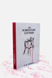
I wanted to convey an accurate image of the book, while also allowing for some ambiguity so the reader could project their own meaning onto the cover. C.S. Lewis books are traditionally marketed toward Christian audiences, and often have light-hearted covers. . . . I wanted the books to appeal to a non-Christian audience, and I wanted the books to have a gritty and more emotional feeling, while also alluding to the extraordinary qualities inside the book.

I believe Will succeeded in his goals . . . and also made the covers simpler and more striking than many of the cluttered covers that adorn my shelf.

C.S. Lewis’ Thoughts on Book Covers

In 1915, Lewis wrote to his closest friend, Arthur Greeves, about hoping to get a library-worthy copy of The Faerie Queene by Edmund Spenser.* Unfortunately, he found the most suitable edition unappealing. “The pictures are tolerable but the print, if I remember, rather coarse (you know what I mean) and the cover detestable.”

In 1936, Lewis was writing to a friend in which he recommends the books of Charles Williams. After commending Williams’ skill in portraying virtuous characters, he adds, “the fact that Gollancz publishes them (in lurid covers) suggests that all this substantial edification—for it is nothing less—must be reaching the ordinary thriller-reader.” The comment makes me wonder what Lewis would have thought of some of the contemporary covers chosen for his own books.

Pauline Baynes was the illustrator with whom Lewis worked for The Chronicles of Narnia. In 1951 Lewis provided her with a sketch of the map of Narnia and its surroundings. The next week he wrote to her.

My idea was that the map should be more like a medieval map than an Ordnance Survey–mountains and castles drawn–perhaps winds blowing at the corners–and a few heraldic-looking ships, whales and dolphins in the sea. Aslan gazing at the moon would make an excellent cover design (to be repeated somewhere in the book; but do as you please about that.)

In a 1958 letter to Jocelyn Gibb, Lewis discusses his changes to the editing proofs of Reflections. His remarks about the cover of the book are interesting, particularly as they reveal his distaste for handwriting fonts, at least in that context.

About the Dust Cover, I like the colour scheme and wouldn’t object. If you have it, I should go for the best design, and archaeology be damned. But I don’t like the letters. We have very nice plain Roman Capitals now . . . and I think it a bad fashion to substitute printed mimicry of ugly handwriting. I wish all publishers would stop it.

Even if the handwriting were a beautiful script, which this is not, the whole idea that decoration consists in making everything masquerade as something else, is surely wrong. Do you like smoking-rooms on ships made up to look like Scotch baronial halls?

There is no better way to end this column than by quoting C.S. Lewis’ glorious description at the finale of The Chronicles of Narnia. As the stories end, the children are ushered into heaven by Aslan who, as he spoke, “no longer looked to them like a lion; but the things that began to happen after that were so great and beautiful that I cannot write them.”

All their life in this world and all their adventures had only been the cover and the title page: now at last they were beginning Chapter One of the Great Story which no one on earth has read: which goes on for ever: in which every chapter is better than the one before (The Last Battle).

__________________

* Lewis would have loved to own this critical edition of The Fairie Queene, which would not be published until seventeen years after he wrote this letter. And, today, you can download volume one for free!


C.S. Lewis and Typos

typos

Who among us has lived a life free of typographical errors? When we learned to type (or “keyboard”), our typing speed was influenced by the number of incorrect characters we included.

Even worse, some infernal source birthed the idea of “autocorrect,” which is occasionally useful for documents, but just as frequently deadly for emails and texts.

Lewis’ own books have included a number of typographical errors. Arend Smilde, a Dutch scholar and translator, has noted a fair number of them on his valuable website.

The truth is, it is possible for errors to creep in whenever original manuscripts are copied.

Even with the Scriptures, existing manuscripts include various minor variations, since the autographs have been lost to history.

This fact necessitates the need for “textual criticism,” and many earnest biblical scholars have devoted their lives to discerning the original text. (“Criticism” in this use, does not connote negativity. It simply refers to study, such as with “literary criticism.”)

Textual criticism diverges significantly from the so-called “higher criticisms” which frequently result in confusion and doubt.* Comparing actual texts is fundamental to the study of all literary creations.

C.S. Lewis wrote a brilliant essay entitled “Modern Theology and Biblical Criticism,” which is currently known as “Fern-Seed and Elephants.” In it, he distinguishes between the various types of criticism and affirms textual examination as utterly valid.

We think that different elements in this sort of theology have different degrees of strength. The nearer it sticks to mere textual criticism . . . the more we are disposed to believe in it. And of course, we agree that passages almost verbally identical cannot be independent. It is as we glide away from this into reconstructions of a subtler and more ambitious kind that our faith in the method waivers; and our faith in Christianity is proportionally corroborated.

The sort of statement that arouses our deepest scepticism is the statement that something in a Gospel cannot be historical because it shows a theology or an ecclesiology too developed for so early a date. For this implies that we know, first of all, that there was any development in the matter, and secondly, how quickly it proceeded.

When books are published, errors slink in. This generates errata, which are presumably corrected in any subsequent editions of the work. (It dawns on me that I’ve never seen an erratum, noting there is only one mistake in the work.)

The Genesis of Today’s Thoughts

Curiously, the article that led me to think about textual errors involves the substitution of an i for an e. The result is that for centuries, people mistakenly believed that Rome had a “Little Temple of Ridicule.” The notion was that the ancient Romans so loved humor, that they “went so far as to erect a ridiculi aedicula, or chapel of laughter.” This curious article is well worth reading (hint: it has something to do with Hannibal’s retreat).

It’s not that the idea of humor shouldn’t be celebrated. On the contrary, laughter features broadly in C.S. Lewis’ works. In a letter written shortly after his marriage to Joy, he alludes to Dante’s portrait of heaven. It is an image Lewis affirmed, and one that I happily anticipate.

Of course Heaven is leisure (“there remaineth a rest for the people of God”): but I picture it pretty vigorous too as our best leisure really is. Man was created “to glorify God and enjoy Him forever.”

Whether that is best pictured as being in love, or like being one of an orchestra who are playing a great work with perfect success, or like surf bathing, or like endlessly exploring a wonderful country or endlessly reading a glorious story—who knows? Dante says Heaven “grew drunken with its universal laughter.”


* For an informative discussion of the different forms of criticism, see this conversation. In response to the question “How is it, then, that the Higher Criticism has become identified in the popular mind with attacks upon the Bible and the supernatural character of the Holy Scriptures?” the author writes:

Some of the most powerful exponents of the modern Higher Critical theories have been Germans, and it is notorious to what length the German fancy can go in the direction of the subjective and of the conjectural. For hypothesis-weaving and speculation, the German theological professor is unsurpassed.

Some of the men who have been most distinguished as the leaders of the Higher Critical movement in Germany and Holland have been men who have no faith in the God of the Bible, and no faith in either the necessity or the possibility of a personal supernatural revelation.

The Ugliest Book

mayan image.png

Every reader knows “not all books are created equal.” This fact has two applications. Most importantly, since books are built from words, the comparison refers to comparing the content or message of different works. In a totally distinct sense, it may distinguish between the differing presentation or physical aspects of the book itself.

Fifty-four years after its discovery, the oldest surviving Mayan text has been officially authenticated. One of the reasons for the delay was that “for a long time, critics of the codex said the style wasn’t Mayan and that it was ‘the ugliest’ of them in terms of figures and color.”

What does that mean? It means that just because the tree bark pages were composed by a less skilled artist . . . in a more primitive age . . . living in a relatively impoverished region . . . with a smaller pallet of colors available . . . its authenticity was questioned.

Not quite what I would consider top flight analysis. Fortunately, Mexico’s National Institute of History and Anthropology has finally righted that wrong. They declared, “The Mayan Codex is authentic and the oldest, legible pre-Hispanic manuscript in the Americas,”

Seriously, the only flaw I can find in the facsimile of the pictograph portrayed above is the attachment of a right hand to a left arm. Then again, if Mark Twain could make the very same mistake roughly eight centuries later, I can forgive the ancient Mayan illustrator.

Illustrative Options

Frankly, the more one learns about the publishing industry, the less responsible we can hold authors for the final look of their works. Rarely do they even get to choose the cover art for their books, although sometimes particularly prominent authors such as J.R.R. Tolkien or C.S. Lewis are granted that privilege. That is how the artwork of Pauline Baynes became intimately associated with the two Oxbridge giants.

The lucky few may even be able to select their own fonts, with many wisely opting for the more trustworthy serif families.

For the common woman or man, we are lucky if our publishers even let us have a veto over the artwork that they commission. The exception to this comes with the nature of the self-publishing industry, where the author possesses sole authority in choosing their cover, illustrations, fonts and format.

Still, those hoping for “traditional” publication should recognize in advance how much control over their book they will forfeit to editors and publishers.

With Paper at a Premium

Even with influence in the selection of artwork, some aspects of publishing lie outside the control of writers. A perfect example of this is found in rationing of paper in Britain during the Second World War. The British War Economy Standard meant books visually declined in production quality.

Paper was rationed, beginning in March 1940, when publishers were allowed only 60 percent of what they had used in 1938-39. The proportion fell to 37.5 percent by January 1, 1942, when the Book Production War Economy Agreement took effect.

rationing

The scheme mandated smaller type, less white space, and inferior papers and bindings. It resulted in some remarkably ugly books, but it conserved raw materials. (“Modernity and Print I: Britain 1890-1970” by Jonathan Rose)

A number of Lewis’ books appeared in these wartime editions. They are quite collectible.

Scarce first impression of the true first edition, produced on wartime economy standard paper, and thin boards, published during the Second World War, especially hard to find in its complete original dustwrapper in collectable condition.

Let’s consider an unlikely scenario. In eight centuries, C.S. Lewis’ writings have been forgotten. Then, one archaeologist stumbles across a rare physical copy of a book, that survived the universal “grand purging” following the transfer of such items to some post-digital, post-electronic format.

What would historians assume about the value placed on Lewis’ work if it was a wartime edition compared to other “regular” books by other authors? They could not be faulted for assuming that the people of our day valued the inferior publication less than the “nicer” editions. (This is assuming that the acid-laden paper of the war years would not simply flake apart in their hands.)

The quality of the paper and print make a strong impression on readers. Just as we often judge books by their cover.

C.S. Lewis, a true bibliophile, illustrates how even a modest book (in terms of content) can be deemed “exquisite.” In a 1935 letter to his friend Arthur Greeves, he humorously describes the impending publication of The Allegory of Love.

I have finished my book which is called The Allegorical Love Poem, and is dedicated to Barfield. The Clarendon Press have accepted it and hope to have it out by May.

As I am to get 12 free copies (Dents only give one 6) you and Tchanie shall each have one and save your silver: and whatever you think of the matter, I hope, from experience of the Clarendon Press, that binding, paper etc will be—in our old formula—excellent, exquisite, and admirable.

In other words, if you can’t read it, you will enjoy looking at it, smelling it, and stroking it. If not a good book, it will be a good pet! It will be about 400 pp, they say. (It will be funny, after this, if they do it in double columns and a paper cover.)

Returning to the Mayan pages with which we began, we sadly are unable to judge them by their original codex in its pristine state. However, the extant pieces possess great historical value, even if scholars took a long time determining the fact . . . and whether or not they would ever consider it to be “a good pet.”


In case you are interested, Mere Inkling has explored Mayan books before, in “One Weakness of Modern Books.”