One contemporary challenge to democracy in the United States is judicial activism. This is the term for jurists who mistakenly think they are in the legislative branch of the American government.
While too many Courts pursue this unconstitutional path, it is refreshing to see one federal Court actually “legislating” within its actual purview.
The District of Columbia Circuit of the United States Court of Appeals has mandated which fonts can and cannot be used for court documents. The National Law Journal says the official shunning of the Garamond font has set “lawyers abuzz.”
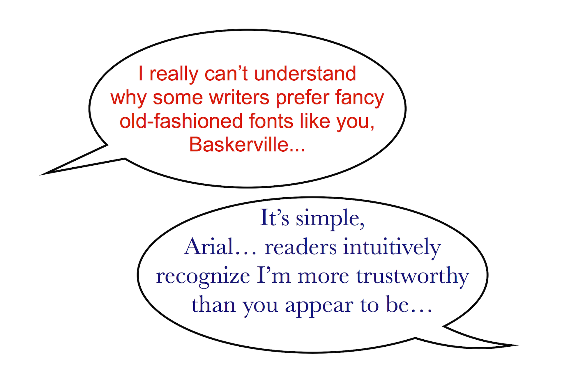
The Court—quite correctly—notes that serif fonts are much more legible than sans serif fonts like Arial.
But that has not saved Garamond, which appears slightly smaller than some other serif fonts. Apparently the fact that all documents must also be printed in a 14 point size does not adequately compensate for the difference.
If you would like to read the formal notice you can find it here.
Consistent with the Court’s magnanimity, while briefs “must be set in a plain, roman style,” they will graciously allow “italics and boldface [to] be used for emphasis.”
C.S. Lewis had a proper respect for the legal system. How could it be otherwise for a man whose own father was a solicitor? Yet one wonders what Lewis would have thought about this strict new requirement in the colonial Courts.
Counting Our Blessings
Since the Court has spoken on the matter of fonts, the question must be settled. After all, to whom could it be appealed?
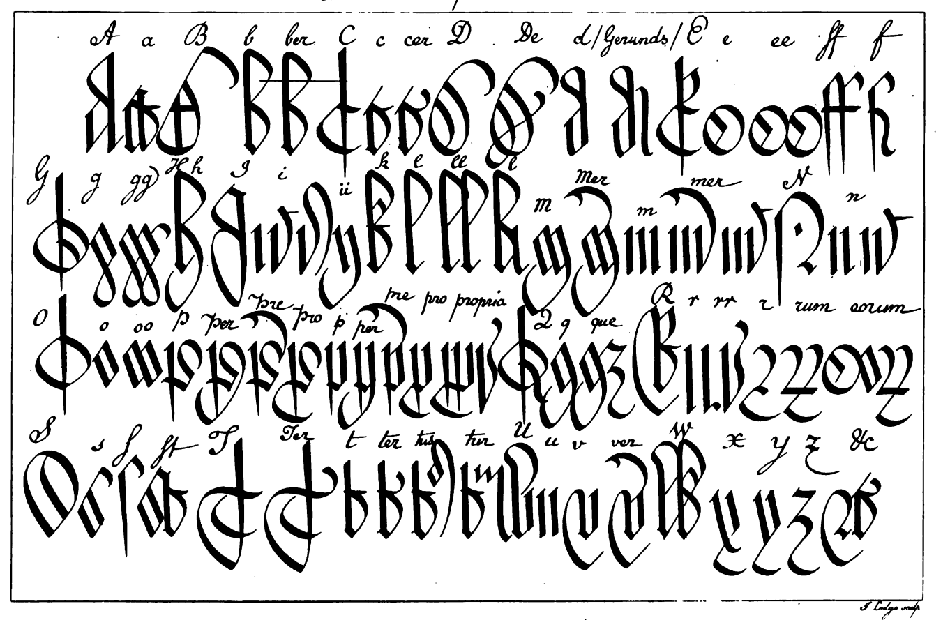
However, we should be grateful that they have limited their judicial caprice to barring sans serif fonts. After all, they could have reinstated Court Hand.
The various forms of writing in which English medieval documents . . . are preserved to us are all derived from an increasingly current writing of the same script which . . . are known to us collectively as Court Hand, that is the writing of the Courts. (Palaeography and the Practical Study of Court Hand).*
Yes, I realize Court Hand dates back to the medieval era, and reinstating it in contemporary American courts would seem asinine on its face, but that certainly doesn’t make it implausible in our current judicial milieu.
C.S. Lewis appreciated the quality of Court Hand. In 1943 he wrote a letter to Gerald Hayes (1889-1955), who was Chief Cartographer for the Admiralty. Hayes had provided some maps for one of C.S. Lewis’ favorite authors, E.R. Eddison. Two of these maps can be found at Inventing Imaginary Worlds.
Hayes gifted C.S. Lewis with a copy of one of these illustrations. Lewis responded with an invitation to visit the Inklings, appreciation for the unique “treasure,” and a compliment about Hayes’ skillful handwriting.
You must come & [visit] our little confraternity if you ever are in Oxford & receive in person my repeated thanks for what is one of my notablest treasures. It has given me again what I have not had for years & years, the old pleasure in a ‘present.’ I wish I could write either modern or court hand as you do!
Fortunately, we live in a digital age when we need not labor to replicate ornate fonts. We can simply add them to our computers and voilà, there they are. In case the Courts resume such a requirement, you may want to add a Court Hand font to your computer today. Even if you do not anticipate being involved in litigation, and simply enjoy elegant fonts, you can find a free copy here.
* You can download a free copy of this book—which belongs in every writer’s library—from the Internet Archive.
And, here is a handy reference sheet for the next time you need to decipher court hand.