 Recent subscribers to Mere Inkling won’t know this, but some months ago I confessed to suffering an addiction. Like many others who love to write, I am a fontaholic.
That refers, of course, to being obsessed with discovering new and exotic font families.
For many months I’ve kept my compulsion in check, but I was recently caught off guard when I stumbled upon some alluring typefaces I had never encountered before.
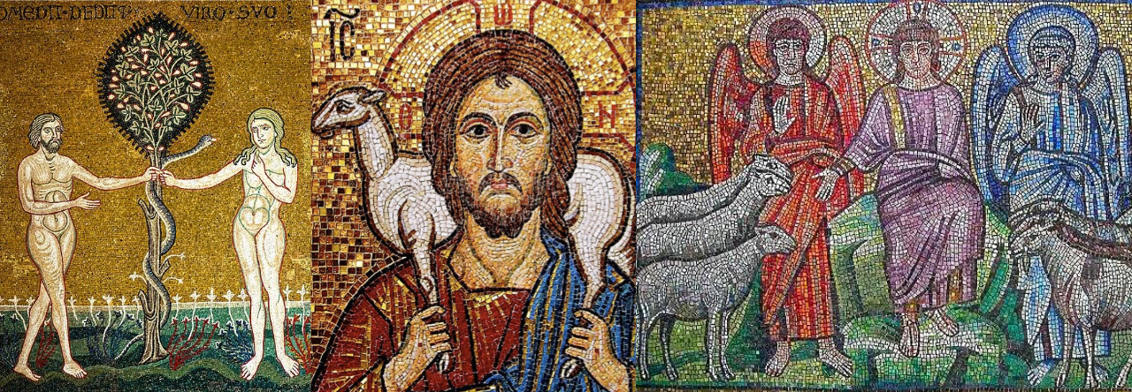
I was particularly vulnerable to their charm due to my interest in medieval history. In fact, I was researching the coloration of illuminated manuscripts when I encountered them.
In case you share my weakness—or, even if you are merely curious—I offer examples of the novel fonts I was “forced” to add to my collection. And, you need not worry, since (if you are so inclined) you can download all of them for free at this site.
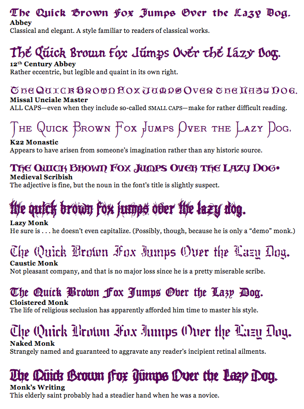
Each of the fonts below has some “monastic” connection. Obviously, some would be more useful than others, and a couple of them are admittedly quite peculiar. However, even the strangest of pens may be suitable for some applications.
Before contrasting some of these typefaces, it’s worth mentioning that you can also download a “Narnia” font—based on the letters used in the Hollywood version of C.S. Lewis’ classics.
And now, without further introduction, the fonts themselves . . .

After finding myself sketching stylistic medieval fonts on my notepad, I’m delighted to find this little blog post. Thanks, fellow “Mere Inkling!”
Good for you. I’m a big scribbler as well and my drawings (doodles) are occasionally (well, rarely) rather artful.
What a fontastic post. :-)
Oh, oh… I sense the presence of another word-related illness… punsterism. You had been get that treated soon!
you, ma’am, are the one with the “fontastic” post. This really made my day
I am afraid that you are a wonderful influence….love those fonts!
Please forgive me when you find yourself spending hours exploring the internet in a quest for new and exciting fonts…
:)
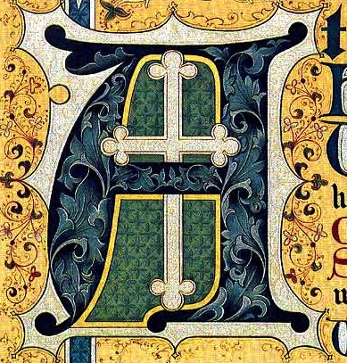
I LOVE the Medieval period and especially illuminated manuscripts! By the way, your illuminated “A” is fantastic! Thanks for the link to the fonts! I hope they’ll work for Mac. Abbey is nice, but I especially like Cloistered Monk. I occasionally think up a reason to use neat fonts, so I will head to your link and monk-ey around with them. :)
Beware of the monkey fonts on the link (yes, there really are some). There’s a nice “L is for Lion” font though…
Cool cool cool!
(Jumping up and down – the captions are equally delightful)
What document is that illuminated “A” from. It’s impressive.
Proof “abstract art” existed long before sanctioned and recognized. Impossible to cage a creative mind.
The location where I found it didn’t include a source, but I believe it’s from the 1800s rather than the medieval period. Probably from a religious publication. It certainly is striking.
What about a font with that beautiful illuminated A? ;)
That would be pretty nice… I’d love to have it on my computer.
Same here.
efrsdfrtgfJEDRKHTG KSJ! http://www.fonts101.com/fonts/view/Unusual/11831/Dwarf_Runes1
sdergfhwem54ruq2NJAHWAMJEHJ! *keels over*
Sorry. You can’t read the rune script in a comment like this. The only way to do it would be to type it out on a computer where you have it loaded, take a screen shot, edit down to the text and load it as a graphic file. I’m am curious about the keeling over, though!
Oh, that wasn’t typed in Dwarf Runes. ;) that was me going spastic on my keyboard in delight! I now have that font loaded on my home computer, though.
Oh, I see… and to think I spent two and a half hours trying to decipher it! (Just kidding.)
This is awesome….I handwrite so many different fonts because I can’t get enough…..thanks for some more to add to my computer!
Never thought about handwriting different fonts, but I guess that in a small way even those of us who simply print, use cursive and outline in block text are doing the same thing!
Thanks for sharing! :-)
Pingback: Choosing Trustworthy Fonts « Mere Inkling
Pingback: Fonts that Can Make Your Literary Dreams Come True – Mere Inkling Press