
Have you ever wondered if publishers change the covers on their books trying to trick you into buying an extra copy? While I’m sure some unscrupulous publishing houses may have engaged in such questionable practices, surely they would never do so with the books of so honest a man as C.S. Lewis!
Over the past forty years I’ve purchased multiple copies of various works by C.S. Lewis. Occasionally I’ve needed to replace a loan copy that was never returned. A number of times when I’ve taught a class on one of his works, I’ve provided everyone with a personal copy. Sometimes I’ve purchased them with the sole intent to give them to the curious—I have some on my bookshelf right now waiting for the right home.
Through the years I have been struck by the frequency with which covers change. Sometimes, of course, it’s due to different publishers gaining rights to the titles. Often, though, it seems to be based almost on whim. Consider, for example, the diversity in covers for the final volume in C.S. Lewis’ space trilogy. (I picked this title arbitrarily, because of the interplanetary subject matter.)
If you examine the collage of covers, you’ll note some similarities and image reuse. However, the thing that surprised me was the way that a single publisher, Pan Books, had no fewer than four different covers. (Perhaps there is something to the suspicion that booksellers are more than happy to sell multiple copies to inattentive readers?)
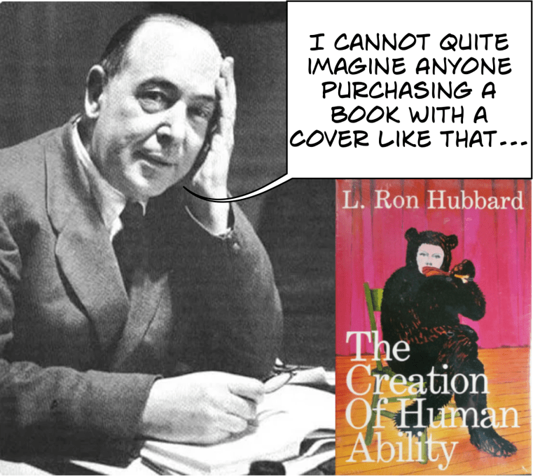
It’s no secret that book covers are extremely important. They can increase the sales of marginal works and suppress the distribution of exceptional books. Their enormous influence gave rise to the wise maxim: “Don’t judge a book by its cover.” Jesus applied a variation of this theme to the publicly righteous hypocrites of his day when he said, “woe to you, scribes and Pharisees, hypocrites! For you are like whitewashed tombs, which outwardly appear beautiful, but within are full of dead people’s bones and all uncleanness” (Matthew 23:27, ESV).
Sadly, I’ve begun reading more than one book that bore an inviting cover and was filled with decomposing grammar, decaying plotlines and putrid characters.
On a website for creative artists, a fan of C.S. Lewis’ works recently experimented with creating innovative covers for three of Lewis’ most popular books.
Will Jacott explains,
I wanted to convey an accurate image of the book, while also allowing for some ambiguity so the reader could project their own meaning onto the cover. C.S. Lewis books are traditionally marketed toward Christian audiences, and often have light-hearted covers. . . . I wanted the books to appeal to a non-Christian audience, and I wanted the books to have a gritty and more emotional feeling, while also alluding to the extraordinary qualities inside the book.
I believe Will succeeded in his goals . . . and also made the covers simpler and more striking than many of the cluttered covers that adorn my shelf.
C.S. Lewis’ Thoughts on Book Covers
In 1915, Lewis wrote to his closest friend, Arthur Greeves, about hoping to get a library-worthy copy of The Faerie Queene by Edmund Spenser.* Unfortunately, he found the most suitable edition unappealing. “The pictures are tolerable but the print, if I remember, rather coarse (you know what I mean) and the cover detestable.”
In 1936, Lewis was writing to a friend in which he recommends the books of Charles Williams. After commending Williams’ skill in portraying virtuous characters, he adds, “the fact that Gollancz publishes them (in lurid covers) suggests that all this substantial edification—for it is nothing less—must be reaching the ordinary thriller-reader.” The comment makes me wonder what Lewis would have thought of some of the contemporary covers chosen for his own books.
Pauline Baynes was the illustrator with whom Lewis worked for The Chronicles of Narnia. In 1951 Lewis provided her with a sketch of the map of Narnia and its surroundings. The next week he wrote to her.
My idea was that the map should be more like a medieval map than an Ordnance Survey–mountains and castles drawn–perhaps winds blowing at the corners–and a few heraldic-looking ships, whales and dolphins in the sea. Aslan gazing at the moon would make an excellent cover design (to be repeated somewhere in the book; but do as you please about that.)
In a 1958 letter to Jocelyn Gibb, Lewis discusses his changes to the editing proofs of Reflections. His remarks about the cover of the book are interesting, particularly as they reveal his distaste for handwriting fonts, at least in that context.
About the Dust Cover, I like the colour scheme and wouldn’t object. If you have it, I should go for the best design, and archaeology be damned. But I don’t like the letters. We have very nice plain Roman Capitals now . . . and I think it a bad fashion to substitute printed mimicry of ugly handwriting. I wish all publishers would stop it.
Even if the handwriting were a beautiful script, which this is not, the whole idea that decoration consists in making everything masquerade as something else, is surely wrong. Do you like smoking-rooms on ships made up to look like Scotch baronial halls?
There is no better way to end this column than by quoting C.S. Lewis’ glorious description at the finale of The Chronicles of Narnia. As the stories end, the children are ushered into heaven by Aslan who, as he spoke, “no longer looked to them like a lion; but the things that began to happen after that were so great and beautiful that I cannot write them.”
All their life in this world and all their adventures had only been the cover and the title page: now at last they were beginning Chapter One of the Great Story which no one on earth has read: which goes on for ever: in which every chapter is better than the one before (The Last Battle).
__________________
* Lewis would have loved to own this critical edition of The Fairie Queene, which would not be published until seventeen years after he wrote this letter. And, today, you can download volume one for free!
